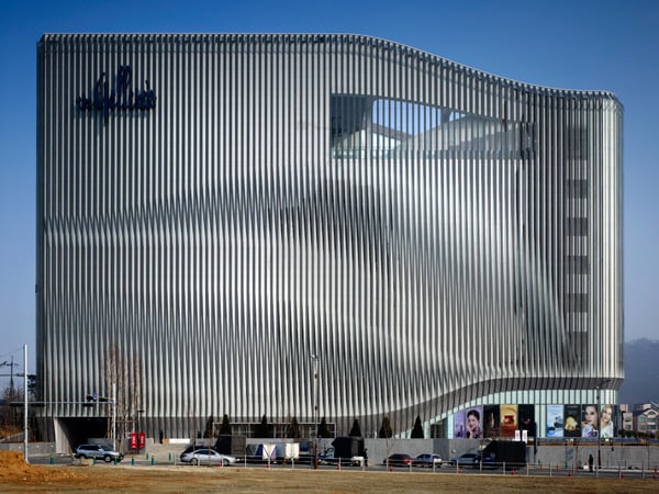
It’s called the Galleria Centercity in Cheonan South Korea, designed to respond to the current retail climate in Asia. It’s a massive department store that also operates as a social a semi-cultural meeting place – a museum if you will.
Rather than being the outcome of a prescriptive, standard-critical approach, the design of the galleria is based on observations of current behavioural tendencies in large commercial spaces. Particularly in South East Asia, department stores serve a highly social function; people meet, gather, eat, drink and both shop and window shop in these venues. The department store is no longer solely a commercial space, it now offers the architect the opportunity to build upon and expand the social and cultural experience of the visitor. If today we are seeing the museum as a supermarket, then we are also now seeing the department store as a museum.
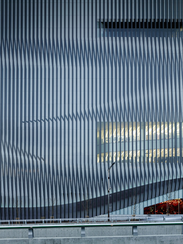
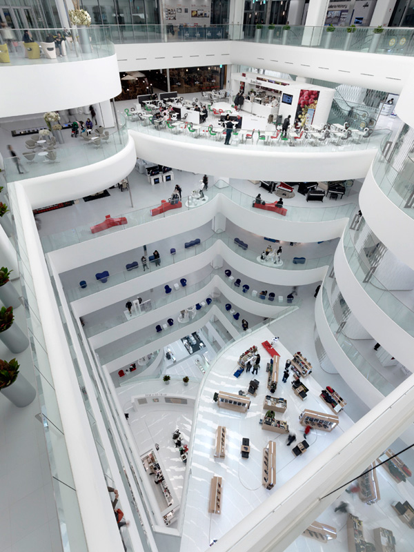
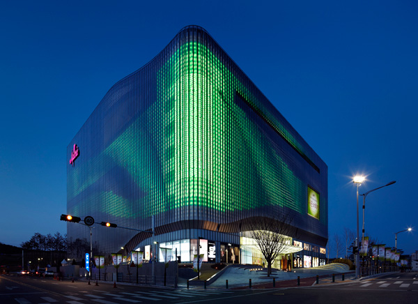
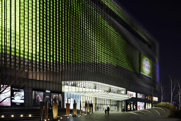
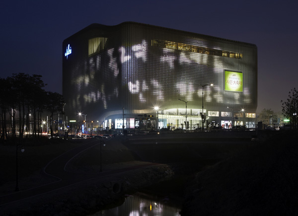
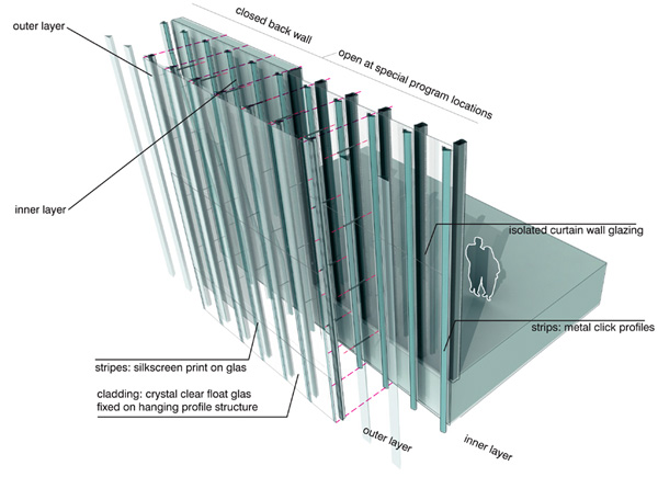
The exterior is a sight to be marveled at. The double layered facades are articulated in a trompe l’oeuil pattern of vertical mullions. The vertical lines on the façade make the scale of the building unreadable; does it contain three floor levels, or fifteen? On the inside, this play with scale and dimension is continued in a way that is at least as radical as the outside. Upon entering, the department store is revealed as a layered and varied space which encourages investigation and unfolds as you move through and up the building.
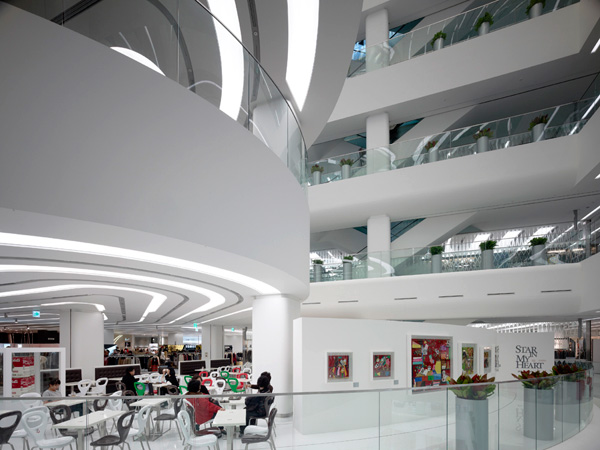
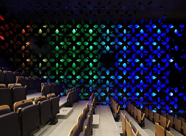
Programmatically, the Galleria Cheonan incorporates a number of cultural and public spaces, including an art and cultural centre and a vip room. In the basement, a food court and specialty supermarket constitute another distinct destination within the building, which is simultaneously integrated with the overall design strategy.
The main architectural theme for the Galleria Cheonan is that of dynamic flow. This is found both inside and outside. The architecture of the 66,000 m ² building responds to its central position by presenting a deliberately changeable aspect all-around. Moiré effects, special lighting and animations ensure that the outside changes appearance constantly.
The double layered facade encloses the building, with a number of strategic openings incorporated into the inner facade layer.These openings provide daylight to the interior. At the same time, the lamellas of the outer façade prevent direct sunlight from entering the building, ensuring a cooler environment, while the use of white finishes throughout the interior minimises the need for artificial lighting.
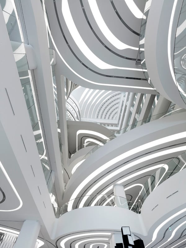
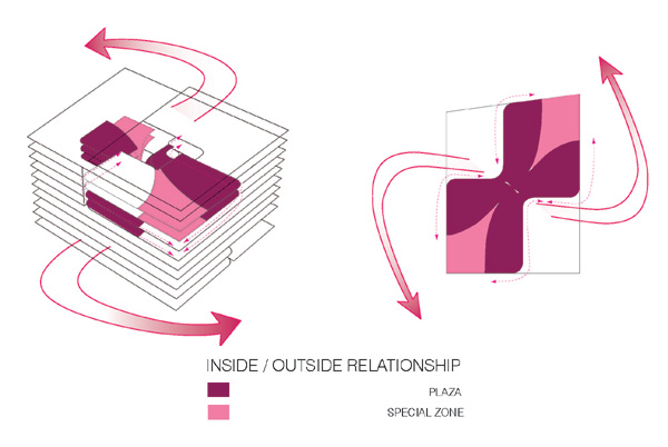
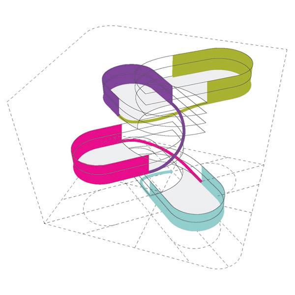
The interior derives its character from the accumulation of rounded plateaus on long columns. The repetition of curves, enhanced by coiled strip lighting in the ceilings of the platforms, gives the interior its distinctive character. Four stacked programme clusters, each encompassing three storeys and containing public plateaus, are linked to the central void. This organisation propels a fluent upstream flow of people through the building, from the ground floor atrium to the roof terrace. As the plateaus are positioned in a rotational manner in space, they enable the central space to encompass way finding, vertical circulation, orientation and act as main attractor of the department store. The spatial and visual connections within the space are designed to generate a lively and stimulating environment, in which the user is central.
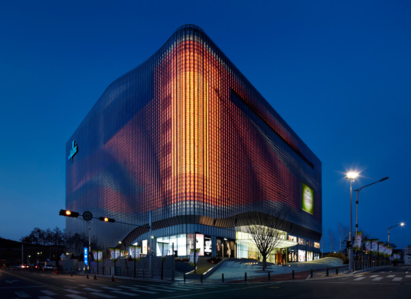
The strategy for the building enclosure consists of creating an optical illusion. During the day the building has a monochrome reflective appearance, whilst at night soft colours are used to generate waves of coloured light across the large scale illuminated surface. The lighting design was developed in parallel with the architecture and capitalises on the double layered facade structure. Computer generated animations specially designed by UNStudio are incorporated into the lighting design and refer to themes related to the department store, such as fashion, events, art and public life.
Rather than creating a platform for a multiple billboard effect made up of individual brand identities, the thematic animated content of the fully integrated media façade facilitates a more holistic and site-oriented urban approach to branding.
Photography: Christian Richters and Kim Jong-kwan
Designer: UNStudio
No comments:
Post a Comment