Explosive Architecture: 10 Volcano-Inspired Structures

By Steph


They’re beautiful and sinister, jutting up out of the landscape with a deceptive peace when inactive, but hiding the threat of death and destruction just beneath the surface. Perhaps it’s that element of danger that makes architects and artists hot for volcano-inspired architecture, giving that distinct sloping form to stadiums, power plants, resorts and enormous self-contained cities all over the world.

Blue Volcano Concept, Zagreb, Croatia

(images via: arch daily)

It’s easy to see why the njiric + arhiteki’s design for this civic arena, housed in an artificial hill made from rubber and paint sprayed onto sheets of corrugated aluminum, has been nicknamed ‘blue volcano’. Conceived for the city of Zagreb in Croatia, the design even features a solar-power-harvesting ‘cloud’ that floats above it, displaying game scores and other information. The cloud also protects the stadium from rain and snow, eliminating the need for a dome.

Taichung Convention Center

(images via: arch daily)

These are unlike any volcanoes you’ve ever seen – or any buildings, for that matter. MAD Architects wanted to give the Taiwanese city of Taichung a world-class architectural landmark that honors the natural landscape of the region, and the crater-like Taichung Convention Center delivers in an eccentric and unexpected way. The interconnected system of buildings is covered in a high-tech pleated ‘skin’ that provides air flow and reduces energy consumption.

Ultra Modern Volcano House, California

(images via: freshome)

With a design as severe as the desert landscape that surrounds it, this house almost looks like a spaceship perched atop a volcano. Built in 1968 in Newberry Springs, California, two hours east of Los Angeles, the Volcano House has been called a ‘modernist masterpiece’ and was, according to the Los Angeles Times, “envisioned to resemble the information center at the construction site of the nuclear generating plant in San Onofre.” The 60-acre estate is currently on the market for $750,000.

Estadio Chivas – Stadium in Guadalajara, Mexico

(images via: design boom)

From a distance, it seems as if a dangerous eruption is underway: a gargantuan white cloud hovers over the mouth of a volcano. But get closer and it becomes clear that this is no ordinary volcano. Estadio Chivas in Guadalajara, Mexico features green walls made of sloped parkland, and can hold 45,000 spectators. It will take another two years for greenery to grow in so that the effect is complete.

Earthquake-Proof Solar-Powered Volcano Towers

(images via: inhabitat)

OFIS Architecture’s All-Seasons Tent Tower concept features two cylindrical structures covered in a shaded net-like mesh that supports greenery in the summertime. But unusual as it is, the mesh isn’t what makes these towers special: a system of concrete cores and composite columns within the towers make them earthquake-resistant, an important consideration in quake-prone Armenia.

Italy’s Volcano Buono Shopping Center

(images via: the coolist)

Unlike all those ‘bad volcanoes’ that erupt violently and cause plenty of problems – like Mt. Vesuvius, just a few miles away – this ‘good volcano’ has nothing but positive things to bring to the community. That is, if you like the design. Vulcano Buono blends in with the Italian landscape, and unlike many similar designs, it’s not just for sports and special events. Designed by Renzo Piano, Vulcano Buono houses a shopping mall, outdoor theater, restaurants, and a hotel. The green ‘roof’ that forms the walls of the volcanic structure supports more than 2,500 plants.

Crystal Island, Moscow

(images via: inhabitat)

Crystal Island, a massive tent-like structure conceived as a city within itself, will be the world’s largest building – if it’s ever built, that is. Foster + Partners envisions Crystal Island as a solar- and wind-powered community packed with 900 apartments, 3000 hotel rooms, an international school for 500 students, theaters, a sports complex and more all in a 1500-foot-tall structure with a footprint five times larger than that of the Pentagon building in the U.S. Construction has been delayed due to the state of the economy.

BEI-Teesside Power Plant, UK

(images via: dezeen)

Built on a reclaimed brownfield along the Tees River, the BEI-Teessidee biomass power plant by Thomas Heatherwick will rise from the industrial landscape like a modern man-made volcano. The power station, which will produce fuel from palm kernel shells, will be covered in vertical greenery to give this barren area an organic-looking focal point.

Jameos del Agua, Resort in a Volcanic Crater

(image via: web de lanzarote)

Behind a wall made of volcanic rock on the fourth-largest of Spain’s Canary Islands, there’s a startlingly beautiful secret: a hidden lagoon full of blind albino crabs that can’t be found anywhere else in the world . Jameos del Agua was formed when the ceiling of a volcanic tunnel, formed by eruptions of the Corona volcano three to four thousand years ago, collapsed into itself. Now a tourist attraction, Jameos del Agua features a swimming pool, an auditorium, gardens, restaurants and night clubs.

Roden Crater, Arizona Art Installation

(images via: grid city)

Since the 1970s, James Turrell has been crafting a highly unusual work of art: a system of chambers and tunnels inside the Roden Crater, an extinct volcano northeast of Flagstaff, Arizona. It’s not scheduled to open to the public until 2011, but speculation about the work has reached a fever pitch among art critics and collectors. The work is shrouded in secret, but the few who have visited say that it highlights aspects of the crater and its natural environment, like the stars in the sky and the subtle sounds of the desert.

http://webecoist.com/2010/12/03/explosive-architecture-10-volcano-inspired-structures/

Forget Fire Pits: Ultimate Outdoor Kitchen Island Design

Nature is great, but outdoor fire pits and stone fireplaces can only take you so far if you want to really cook a summer meal out on the porch or patio. Â This truly integrated kitchen island design goes beyond the stand-alone gas BBQ grill – perhaps in part because it was created by a landscape architect.

Jamie Durie worked with Electrolux on the construction of this custom outdoor kitchen concept. Plans and ideas in the mix were inspired in part by class indoor needs: it has everything a normal kitchens require – Â islands, cabinets and stainless steel appliances – but plans on how to build it were also informed by garden aesthetics and the advantages of an open layout.

An integrated sink, faucet, barbecue and burner sit on the surface of the main island while other functions rest below – not unlike a normal kitchen plan. However, sizable planted elements add a level of greenery that separates other built-in pieces (including a nice wooden bench) while creating relationships to the other garden-variety plant life surrounding the deck. Conveniently-curved surface edges help rainwater drain from the counter into adjacent flower beds as well.

It might not be the ultimate kitchen design, but it goes much further in terms of equipment, storage, supplies and environmental sensitivity than most designs along the same lines. Generally, professional or DIY designers err either on the side of replicating the same strategies used in an indoor kitchen or accidentally marginalize the role of outdoor cooking, eating and gathering, thus relegating their projects to second-class status in terms of both style and function.

http://dornob.com/forget-fire-pits-ultimate-outdoor-kitchen-island-design/

Private Island: Ultra-Modern Kitchen ‘Floats’ in White Space


Nothing says ‘this room is special’ like setting it apart both in terms of material choice and physical space. For residents of this ultra-modern loft, it is clear that the kitchen is the top priority; it is the core area around which the rest of the layout (also be the designers of GraftLab) revolves.

In plan, the angles of the kitchen define the adjacent spaces. In perspective, the ‘island kitchen’ is both a unique built-in space in the center of the condo and a semi-freestanding partition that helps divide the adjacent living and dining areas that wrap around it.

Clad in high-grade wood veneer – in turn cut by thin and criss-crossing lines of black – the kitchen encourages movement through and around it, each perspective different from the last. Shelves and counters are also sliced out of the main volume, making it seem almost as if the space was hewn from a solid block of wood.

A small bathroom toilet space is also carved into the core kitchen box, accessed from the opposite site of the main cooking and food preparation spaces and hidden nicely in a cove that is almost invisible when closed (its door being made of the same sheets of plywood veneer that cover the rest of the zone). Across the way, and not for the shy, sits a bathtub which is surrounded by stone which also connects back into the flooring of the kitchen area – a strange but interesting design choice.

http://dornob.com/private-island-ultra-modern-kitchen-floats-in-white-space/

Live, Work, Remodel: Bold Brick Home + Office Townhouse

One bold move follows another in this captivating (if experimental) interior and exterior redesign of a classic Dutch brick townhouse. Painting over not only the existing brick walls but windows too … well, it only makes sense in context. Take a look, and consider the client: an architect looking to make a livable space as well as a studio.

After laying a layer of paint, almost ‘resetting the canvass’ if you will, Studio Rolf (images by Frank Hanswijk) inserted a set of extremely contemporary box-shaped windows that do not align in the least with the original plan, but suit the needs of current users instead.

Unlike many modern refabs, the decisions were not based on black-and-white ground rules about preserving the existing structure. What starts on the outside moves inside, with select brick and stone surfaces being painted (surprise!) black or white as it suits the room in question.

That is not to suggest that there is no rhyme nor reason to the changes and choices made, but they are more subjective than one might expect to find – artistic moves rather than rigorous, function-driven design decisions.

One could argue that the design is taken too far – that it does not reflect its residential neighborhood and sticks out like a sore thumb. That argument, however, works both ways: after all, an architecture-and-design studio should, perhaps, stand out from the crowd … not just to advertise its services, but also to make a clear visual distinction between itself and the non-similar functions of surrounding buildings.

http://dornob.com/live-work-remodel-bold-brick-home-office-townhouse/

Healing Mining Pits with Self-Sustaining Underground Skyscrapers

The earth is pocked with giant pits like scars, left behind by mining operations that take what they seek from the land and then leave the site in ruin. But what if we could use those gaping holes as the basis of new underground cities? ‘Above Below’, a proposal for the 2011 eVolo Skyscraper Competition, gives one such mining pit a new life with a bustling underground skyscraper where a self-sufficient community can live, farm, work and play.

This unusual inverted skyscraper design, by Matthew Fromboluti of Washington University in St. Louis, was created specifically for the massive Lavender Pit Mine outside of Bisbee, Arizona, which measures an astonishing 900 feet deep and 300 acres wide. Built around a ‘solar chimney’ that provides light and ventilation to the deepest reaches of the structure, ‘Above Below’ would be virtually undetectable on the surface, with a dome roof covered in native vegetation.

The underground tower is entirely self-sustaining, with its own source of electricity and a water recycling system. Below, in the steppes of the mining crater, tiered platforms planted with crops benefit from sunlight that streams in through skylights in the roof. A light rail system would even provide an easy means for residents to reach the nearby town of Bisbee.

While such underground structures wouldn’t be a viable solution to reclaiming all of the mining pits that dot formerly pristine landscapes in such places as the Appalachian Mountains, especially because such sites tend to be isolated, ‘Above Below’ is an intriguing idea for Bisbee in particular. Not only does the design completely turn the concept of a skyscraper on its head, it could be an interesting solution for habitable communities in harsh desert environments like that of Arizona.

http://webecoist.com/2010/11/26/healing-mining-pits-with-self-sustaining-underground-skyscrapers/

Space-Saving Staircase Shelves for Floor-to-Ceiling Storage

It is technically a bit untrue (most of the time) that one can ‘run out’ of space. Consider the overhead area between yourself and the ceiling, for example. Sure, you want to keep it so you feel comfortable and to allow natural and artificial light to percolate through spaces … but a lot of it is not even necessary for those secondary needs.

This simple modern design by Danny Kuo blends aspects of classic studies and libraries with present-day sensibilities about craft, materiality and saving space. Lower wooden boxes slide out to become steps from which one can reach upper shelves and cabinets.

Since the staircase functionality is built-in, there is no need for the traditional rolling ladder or staircase-on-wheels one associates with floor-to-ceiling bookcases. This, in turn, helps save even more space.

Beyond the big idea, the details are treated with exquisite precision, too, with woodwork that is appealing to the eye and solid to the touch for each of the many pieces involved. Finally, the fact that each wood box is an independent module makes it possible to swap out one type for another as needed, placing more emphasis on cabinet-style, swing-open spaces or sliding drawers depending on what kind of storage is desired. This product would lend itself exceedingly well to mass-customization.

http://dornob.com/space-saving-staircase-shelves-for-floor-to-ceiling-storage/

New Black: Bold Night-Club-Themed Condo in an Old YMCA

When it comes to architectural and/or interior design, the client is always right. So when the resident requests that their home look like a Shanghai night club, who are the designers to object to this decision? Radical remodels are, after all, ‘the new black’ when it comes to adaptive reuse in architecture.

Designed by The Apartment, an NYC interiors-oriented agency, this space went from a derelict ex-YMCA filled with rusty old lockers and bland light-colored walls to a dark and intense space that does indeed look as if it might be open for some late-night business.

Intentionally gaudy gold-colored and framed faux-glamorous objects deck the walls, standing out brilliantly as bright decor against the black background. Disco-balled-shaped lights are suspended upon the likewise dark dining room table-and-chairs set that might as well be part of a VIP back-stage area.

Walls, meanwhile, are apparently for wimps – there are precious few dividers between different spaces, including a relatively wide-open bathroom with a raised (and black-tiled, of course) bathtub. Spotlights make sure nothing feels too private as well.

This design approach is definitely not for everyone. Then again, it was never intended to be. Clearly both the designer group and client were shooting for something strange, sensational, unique and inspired … if you find it less than livable, just be glad you do not have to live in it!

http://dornob.com/black-bold-new-night-club-themed-condo-in-a-used-ymca/

Wood & White Swirl: Winding Up a Unique Spiral Staircase

Anyone else reminded of a chocolate-and-vanilla swirl ice-cream cone? In isolation, this stairwell looks like a work of art – a winding multi-story sculpture composed of rhythmic wood steps and a sweeping white curve. More remarkable than the staircase and handrail, though, are the way they wind into the rest of this interior design.

Wood and white are, in fact, core themes throughout each space. David Clovers Studio used their contrast of tone, texture and detail to create a kind of faux horizon line that emphasizes the spacious upper half of each room while providing variegation along the bottom. This surgical material splice translates into the stairs almost seamlessly, as you can see from the photo directly above.

The two separate material planes begin to take on an infinite set of visual possibilities as one moves up the stairs, changing in relation to one another with each new step and corresponding perspective.

The solid-white side rail also serves as a light well, bouncing natural light from one floor to the next up this central winding space, but without detracting from the warm, rich, dark and heavy feel of the wooden risers and treads.

http://dornob.com/wood-white-swirl-winding-up-a-unique-spiral-staircase/

The Puzzling 3D Digital Art of Kazuhiko Nakamura

Amid the sea of digital art displayed online, many artists get lost, but there’s simply no way to overlook the bizarre robotic creatures and complex machinery of Kazuhiko Nakamura. Eschewing the photorealism trend, this Japanese artist draws an incredible cornucopia of futuristic cyberpunk imagery from his mind and puts it together like a puzzle, one piece at a time.

Nakamura says that each work continues to transform and reveal itself to him as he works in an unpredictable metamorphosis that results in “restructured fragmentary images [that] are reborn as the mechanical mirage” in a desert of pixels.

Though what we as viewers see is the final result, the assembled Frankenstein’s machine of Nakamura’s imagination, some images give us a peek at the many hidden components that make up the whole. In ‘Automaton’ (top image), Nakamura gives us two views of the same robotic creature, a torture machine disguised as an antique mannequin. The one on the left reveals the frightening drills, saws, bullet teeth and an insect-like brain that lay behind a facade that opens up like a gruesome mechanical flower.

“Now a lot of 3D artists pursue photorealism in 3D modeling,” Nakamura told Templates Blog. “Of course this trend is pretty interesting to me too. However, I like that special creativity and subjective expressions that the painter puts into the real object. I put my own vision of the image into the object and I think this is what makes my works so special. I search for my image tenaciously trying to create the best combination of the shapes, textures and lighting.”


http://weburbanist.com/2010/11/13/the-puzzling-3d-digital-art-of-kazuhiko-nakamura/

Architecture Building Daewon Park Observation Tower


An ascertainment belfry for the burghal of Seongnam in Korea architecture by Korean artist Changki Yun. The Daewon Park Anchor was an access for a antagonism but did not win. The dream of flight is blissful. Just the anticipation of amphibian in the sky brings abundant action to attack to accomplish the dream. However this dream is now a reality. For the best appearance “Cloud 360? alotted all its amplitude in the sky. The arena akin was larboard as accessible amplitude and two capital elevators carriage visitors to the sky. The restaurant, cafe, and mediatech are all amid in high levels of the billow observatory. This new anchor is abiding to become the new battleground of the Sungam district.

Shanghai(d) Expo 2010: 15 Cutting-Edge Architectural Designs

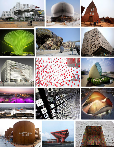
(Images via: Shanghai Cultural China, Boston.com, Arch Daily)

When you’re awarded the highly coveted position of official host city to the world’s latest, greatest and inarguably grandest exhibition fair, you better be prepared to spend some major dinero (or in this case, Yuan) to put on the glitz. At a personal expense of $4.2 billion dollars, China is definitely pulling out the stops for the anticipated 70 million visitors of their upcoming Shanghai World Expo, taking place in the Pudong District along the bank of the Huangpu River from May 1 to October 31, 2010. Their developing nation status should be easily forgotten now that they’re embracing a 21st century cultural and economic sensibility as reflected in their Expo theme “Better City – Better Life”. It will be hard to outshine China’s ambitious pavilion plans, but with 42 additional countries setting up shop for the duration of the event and enormous budgets being earmarked for their own respective architectural spectacles, the proof’s in the pudding. Behold the most eye-catching, heart-stopping, structurally visionary creations that visitors will be treated to when they plunk down their $24 admission fee.

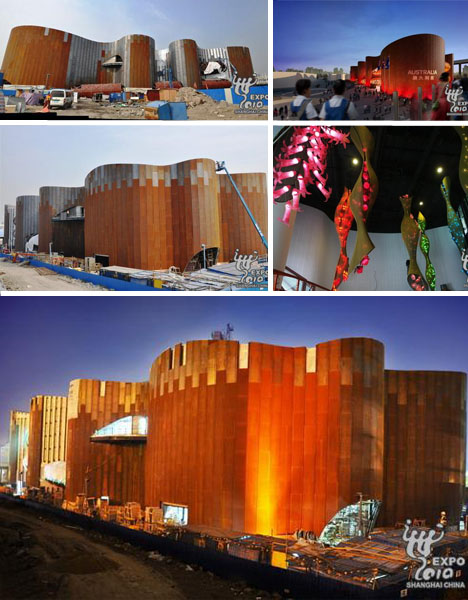
Australia’s Pavilion

(Images via: Shanghai Cultural China, Chenzen)

Inspired by the colossal and entirely sacred Ayers Rock landmark that juts out of the Northern Territory of Australia, their color-changing “Uluru” pavilion emulates the earthy ochre-red appearance of its namesake due to the gradually-oxidizing steel façade. At an expense of $76 million, the land down under asks its pavilion guests to discover the real Australia through a combination of “ImagiNation” cultural exhibits, interactive displays, artistic representations of their history and…naturally, the indigenous tastes of their distinctive cuisine.
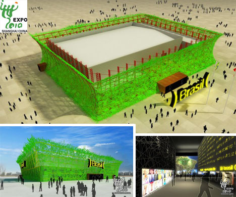
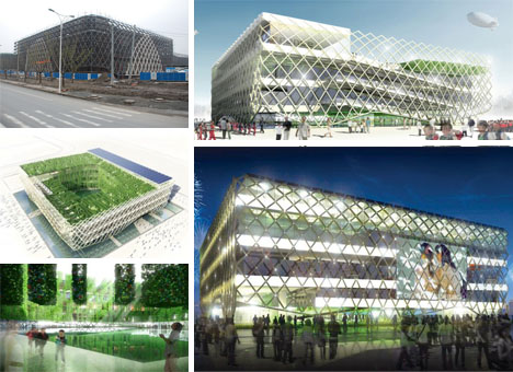
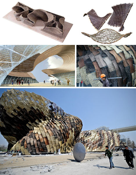
Brazil’s Pavilion

(Images via: Shanghai Cultural China, Expo 2010, Arch Daily)

Said to be among the largest of all the pavilion structures this year, Brazil’s rectangular design – created by Architect Fernando Brandão — pays homage to Beijing’s 2008 Olympic Game National Stadium (a.k.a the “Bird’s Nest”). Its “Pulsing Cities” theme acknowledges how Brazil continues to pursue sustainable development while still balancing the livelihood of its residents. The unusual looking design — composed of a metallic framework with thousands upon thousands of recycled wooden pieces interlocking within a mesh exterior — is taken one step further with the addition of a liberal coat of retina-searing green paint. It offers a complementary backdrop to their goal of educating the public about the country’s strategic management of their precious natural resources and dedication to using green energy alternatives.
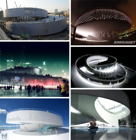
Denmark’s Pavilion

(Images via: World Expo Blog, Nuts Bike, Dezeen)

One of the most notable features of Denmark, which was brought to light during the 2009 Copenhagen Climate Change Conference, is its bicycle friendly infrastructure – an integral design component in their roof top pavilion. Incorporating 1500 eco-friendly two wheelers for visitors to take advantage of, the Danish Pavilion revolves around the notion that its traditional fairy tales can be appreciated while attendees put their pedals to the metal so to speak. The spiral knot-tied architecture – really just a looping bicycle and pedestrian-friendly ramp — contains a pond at its core as well as the original “Little Mermaid” statue from Copenhagen Harbor.

France’s Pavilion

(Images via: World Expo Blog, China Briefing, Expo 2010)

With a “Sensual City” design scheme, the tres cultural birthplace of impossibly thin supermodel women who perpetually indulge in croissants, gallons of wine and decadent truffles is shelling out $74.4 million to bankroll their water-surrounded, seemingly floating 6,000 square foot structure. Purportedly a “shining example of energy efficiency and recycling techniques,” the airy box-woven design – which contains lush French-style gardens within – is (unlike its brethren) constructed for long term permanence and will be given to China as a gift after the Expo has concluded. Those who appreciate artistic masterpieces will be able to get their fix when France displays works from such masters as Rodin, Millet and Van Gogh, all under its lush, botanical ensconced pavilion roof.

Germany’s Pavilion

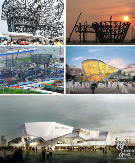
(Images via: China, World Expo Blog, Shanghai Government, Xinhuanet

Architect Lennart Wiechell is the brainchild behind Germany’s $67 million 6,000 square foot pavilion, which reflects the theme of balance amid cultural identity, globalization, modernization and preservation. With four separate architectural components, the unit as whole appears to be precariously positioned, and yet that’s the whole point of the design – to convey a sense of intrinsic support when all the features work together as a unit. The piece de resistance, located in the “source of power” exhibition hall, is a 3 meter wide, 1.2 ton, noise and movement activated revolving metal sphere studded with 400,000 LED lights.

Great Britain’s Pavilion

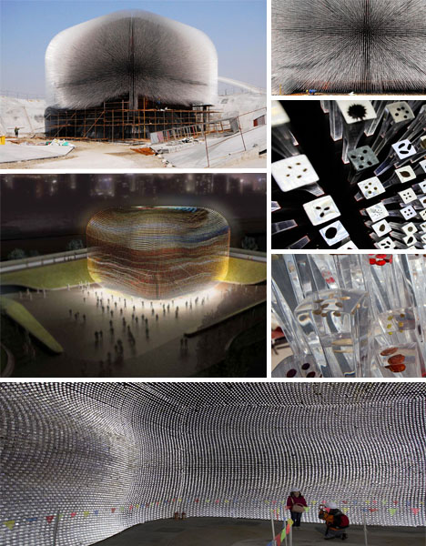
(Images via: Boston.com, Yatzer)

Reflecting the relationship between the built environment and what exists untouched in Mother Nature, the outrageously audacious 20-meter-high porcupine-like Seed Cathedral consists of 60,000 narrow 7 meter long translucent fiber optic acrylic rods, each tip embedded with varying seeds that are representative of the ensured future and longevity of mankind. Designed by the innovative, forward-thinking and internationally acclaimed team of Heatherwick Studio, the product of their efforts has to be the most extraordinarily risky yet phenomenally successful example of modern art on an architectural level. Radiating ambient light during the day and a self-illuminating structural glow once the sun goes down, the design even responds to breeze patterns by undulating accordingly, providing a multi-sensory event for all to witness.

Italy’s Pavilion

(Images via: Shanghai Cultural China, World Expo Blog)

Have you ever seen a shimmering vision in concrete? Italy’s modular pavilion slabs, embedded with optical glass fibers, yield a 3,600-square-meter structure that appears to be translucent in nature and ever-changing as the sun progresses through the sky. Consisting of 20 unique shapes representative of the county’s distinctive geographical regions and bound together by intersecting lines (or “pick up sticks”), the most interesting thing about this design is that it will be recycled and reconfigured simply by removing the anchoring pieces.

The Netherlands’ Pavilion

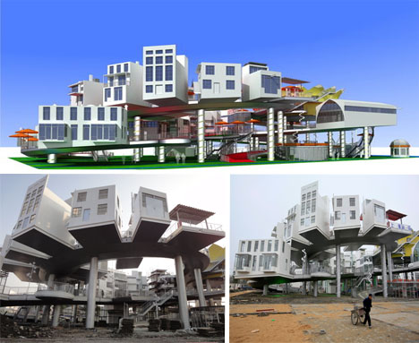
(Images via: PR Log, Boston.com, Shanghai Scrap)

Designer John Kormeling’s Dutch Pavilion, entitled “Joy Street”, is a literal figure-eight-shaped assemblage of 26 mismatched yet oddly harmonious structures that come together in cartoonishly cheerful nature. Seemingly plucked straight from the pages of a classic Seussian tale, the artist did his best to embody the classic traditional architectural styles emblematic of his country while also paying close attention to sustainable and eco-responsible factors. Honoring Chinese traditions of luck and good fortune, the eight shaped appearance is just as strategic a design decision as the exterior paint color of decisive, statement-making red (which is in the process of being slathered on).

Poland’s Pavilion

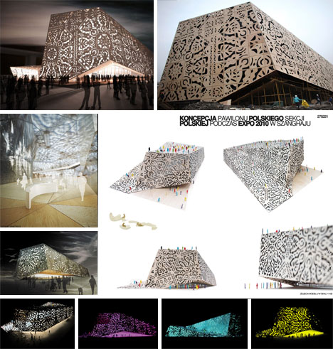
(Images via: PR Log, Expo 2010 China)

The site of three ecologically treasured circumboreal regions, Poland is known for many unique national treasures — including Maria Curie, distinctive baroque architecture, delectable pierogi — and now they can add their absolutely stunning folk-art inspired 3,000 square meter pavilion to the list. Reflecting the look of traditional hand cut, intricately patterned paper, the exterior of the entirely original architectural masterpiece is composed mainly of laser-cut plywood with polycarbonate, glass, hydro and/or UV resistant panel wall accents which also serve as movie screens upon which Polish cultural films will be shown. It is worth noting that the design team of Wojciech Kakowski, Natalia Paszkowska and Marcin Mostafa earned top honors in the design category of the 2010 EXPO’s architectural pavilion offerings for their eye-catching concept.

Russia’s Pavilion

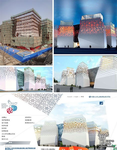
(Images via: Expo 2010, Shanghai Scrap)

Yet another imaginative design seemingly torn from the pages of a treasured story book, the inspiration for the Russian pavilion actually stems from the historical patterns found on women’s clothing and the desire to present a magical world as seen through the eyes of a child. When you look past the pleasing textural contradictions, the 6,000 square meter design encompasses one 15 meter tall main structure linked to 12 irregularly shaped red, white and gold 20 meter tall towers (which represent the full calendar year).

Saudi Arabia’s Pavilion

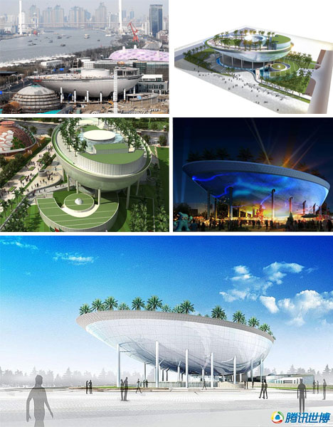
(Images via: E China Cities, Expo 2010, Shanghai Daily)

Saudi Arabia’s surreal $146 million pavilion desert scape – believed to be the most expensive among the 2010 World Expo offerings — is distinctive not only for its natural contrasts but particularly for the top deck of its suspended “moon boat” shaped structure. Boasting water features as well as 150 rooftop date palms, it has the extra-added bonus of a 1,600 square-meter cinema screen (about a quarter the size of a soccer pitch), reportedly the largest one on earth.

Spain’s Pavilion

(Images via: Boston.com, Design World, World Expo Blog)

With its steel inner workings and 8,524 multi-colored, waterproofed, woven wicker exterior tiles, Spain’s $2.6 million 8,500 square meter structure is unlike anything else that will be on display at the 2010 World Expo. One of the visual benefits of using rattan covered exterior panels is that an ethereal light streaming effect is generated which also helps to ensure that the inner structure maintains a comfortably consistent temperature. Furthermore, if you look closely at the beige brown and black exterior, you can identify Chinese characters that are representative of natural elements such as the moon and the sun.

Switzerland’s Pavilion

(Images via: Arch Daily, Expo 2010, EcoFriend, World Expo Blog)

Switzerland’s inspiringly sustainable yin and yang concept, created by Buchner Brundler Architects, is immediately striking due to its exterior biodegradable soybean fiber curtain which breaks down within two weeks after being covered with soil. Incorporating dye-sensitized electricity-generating solar cells, the curtain conveys a forest like appearance that appears to illuminate from within long after the sun has set. The 4,000 square meter pavilion, which cost $18.52 million to execute, even has a rooftop cable car system which leads visitors to a flowering meadow.
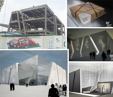
Turkey’s Pavilion

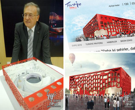
(Images via: Shanghai Scrap, Expo 2010 China, Arch Daily)

Daring to make its competition quiver with intimidation and a severe inferiority complex, the fantastically dramatic 2,000 square foot Turkey pavilion embraces its cultural roots by recreating design elements found in Neolithic “Catalhoyuk” settlements and adhering to a “Cradle of Civilization” theme. Never has a red and beige tinted box looked so good with its built-in animal sculpture, artistic open air cutouts and maze like interior swirl.

The United Arab Emirates’ Pavilion

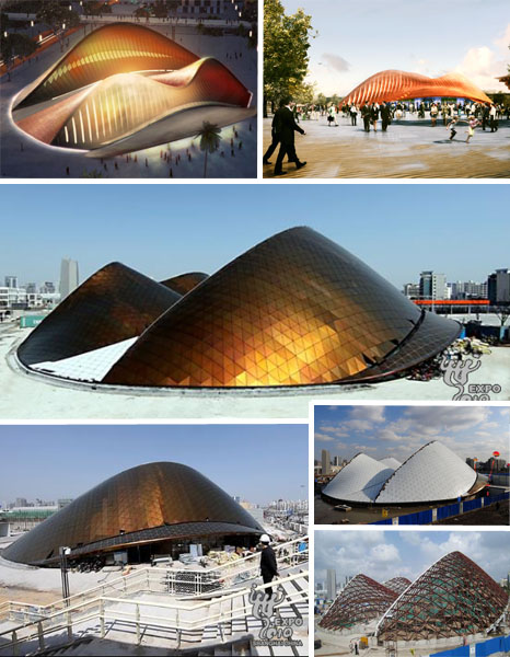
(Images via: Cultural China, Vyonyx,Expo 2010 China, Arch Daily)

Always inclined to embrace a ‘bigger is better’ philosophy, the UAE’s 6,000 square foot “Sand Dune” pavilion seems to defy the laws of architectural physics with its somewhat undulating appearance which mimics what might happen if a gust of wind were to lift up a patch of desert sand and help it to take flight. In actuality, the Empty Quarter sand dunes are its fitting artistic inspiration. Interestingly, the north side of the structure allows sunlight to stream in while the south side is impervious so that solar heating is minimized. Even more remarkable is the fact that the country, long criticized for its irresponsible excess and lack of eco-responsibility, is surprisingly breaking down the entire pavilion at the event’s conclusion and reassembling somewhere in the UAE.

http://weburbanist.com/2010/04/20/shanghaid-expo-15-cutting-edge-2010-architectural-designs/