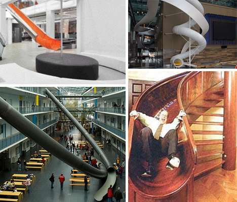
Remember how much fun it was to zip down the slides at the playground as a kid (or as an adult, depending on your disposition)? The almost-weightless feeling of flying through space was so exhilarating that you just couldn’t wait to climb the stairs and do it again, over and over. Some architects and artists are taking a cue from their younger selves and bringing the gleeful fun of slides into buildings for everyone’s enjoyment. But far from just being indulgent bits of fun for the office or home, they also serve some unexpectedly practical purposes.
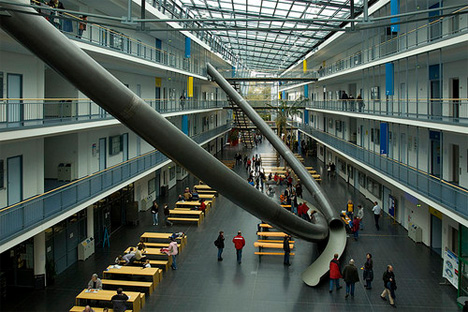
Technische Universitat, Munich
(image via: Gizmodo)
Architects seem to be trending toward interactive buildings. No longer are we content to just exist inside of a structure; we want to be able to experience it. That is the idea behind the architectural slide trend. Buildings with interactive elements such as slides provide a point of interest for the people who work and study inside of them – not to mention a tension-breaker, a mid-day laugh and (provided you take the stairs up to the top) even some exercise. This double slide in a college in Munich takes riders from the top floor to the patio on the ground floor in a matter of seconds.
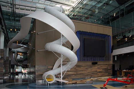
Corus Entertainment, Toronto
(image via: blogTO)
The tubular white slide inside Corus Entertainment’s impressive new Toronto headquarters spans three stories and offers employees and visitors a chance to take a break from whatever grown-up responsibilities they are dealing with and simply enjoy being young at heart for a few moments. Besides offering a fun distraction from the day that lines up well with the company’s area of business, Corus’ slide adds a unique architectural element to their very modern new building.
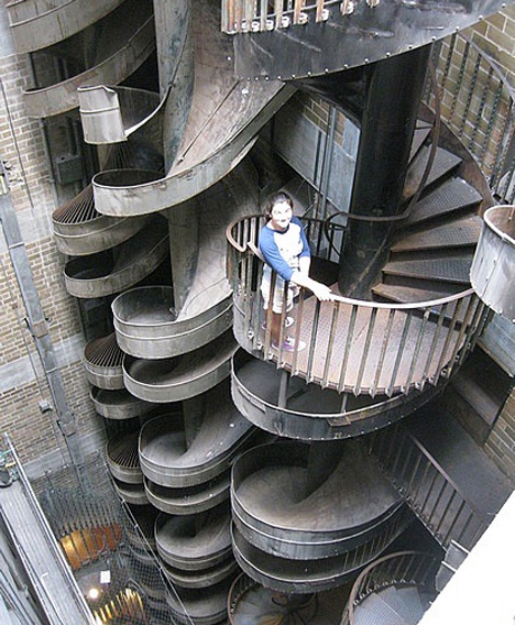
City Museum, St. Louis
(image via: TravelPod)
The City Museum is a truly fun experience, with all sorts of artistic and creative wonders for visitors of all ages. But everyone becomes a kid again when faced with the massive seven-story indoor slides. The twisty metal slides are rather scary-looking, but who could resist the chance to shoot down a chute that is so distinctive?
Grip Limited, Toronto
(images via: Mashable and Unlimited Magazine)
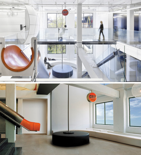
Indoor slides can add a sense of fun to just about any space (we’re thinking even prisons would be happier with slides), and that’s exactly what the heads of Grip Limited had in mind when installing the “big orange slide” in their Toronto office. The slide represents the fun, open nature of the company and their creative approach to problem-solving. This is what is at the heart of the architectural slide movement: fun, openness, and a willingness to throw the prim, proper adult attitude out the door in favor of taking a more relaxed view.
Google, Zurich
(image via: Treehugger)
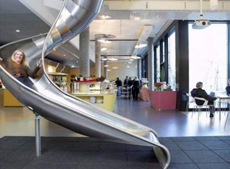
Could there be reasons for this trend that extend beyond the instant gratification of having fun at the office? It turns out that many companies which incorporate slides also do so for the health of their employees and visitors. No one takes an elevator to the top of a slide: they run up a set of (usually quite steep) stairs again and again, promoting at least a few moments of exercise and boosting energy. And even people who only use the slide as an egress from an upper floor after riding the elevator up are doing the company – not to mention the planet – a favor by saving the energy that an elevator ride would have used. But judging from the face of this Google employee in the company’s Zurich office, sliders aren’t thinking of the more abstract benefits when they jump on the slide; they just want to feel that rush of wind and joyful burst of speed.
Tate Modern, London
(images via: Carsten Holler and Rory Hyde)
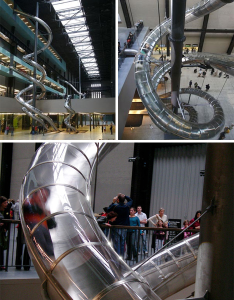
An art museum may be the last place you would expect to see a huge slide, but in the Tate Modern’s Turbine Hall an artistic/architectural slide actually fits perfectly into the surroundings. Belgian artist Carsten Holler installed this gigantic sculptural slide in the museum in 2007, inviting visitors to experience art like never before. Placing a slide – traditionally a child’s toy – in the middle of an art museum where patrons are generally asked not to touch anything is a particularly delightful juxtaposition of art and play.
Sliding in to Home
(images via: Dornob 1, 2)
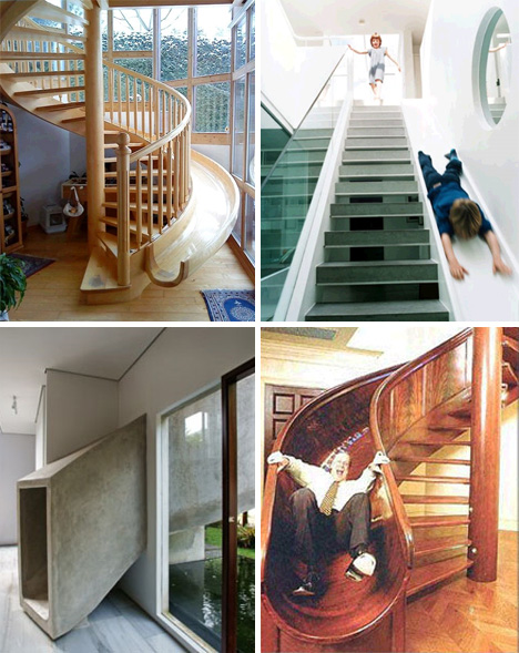
Public spaces aren’t the only places you’ll find architectural slides. These fun additions are making their way into homes all around the world. Whether it’s a child’s playhouse that is topped off by a quick exit from the second floor to the first or a stuffy den that was just screaming out for a fun feature, slides are becoming surprisingly common in residences. And when home is this exciting, even taking out the trash can be a treat!
http://weburbanist.com/2011/01/26/stepping-out-10-stupendous-indoor-architectural-slides/
No comments:
Post a Comment