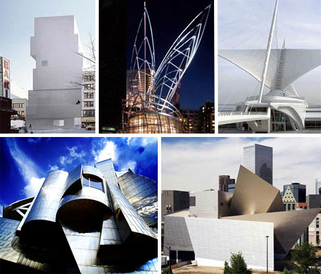
When did making museums start to become an art form in its own right? Sometime in the last two decades, as wealthy patrons began flooding museums with donations so they could expand their collections, the architecture of museums around the world became nearly as important as the art and history they contain. The trend is said to have begun with Frank Gehry’s Guggenheim Bilbao and has appeared around the world in an astonishing variety of forms, from bulky, geometric behemoths to sculptural structures as light as a bird.
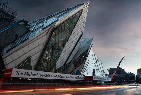
Royal Ontario Museum Extension, Toronto
(images via: Sam Javanrouh)
The Michael Lee-Chin Crystal addition to the Royal Ontario Museum began as a sketch on a paper napkin at a wedding. Berlin-based Polish-American architect Daniel Libeskind’s design has met with equal parts criticism and praise from the public for its daring juxtaposition of glass and steel against the original historical brick structure. Of the building, Libeskind said “Why should one expect the new addition to the ROM to be ‘business as usual’? Architecture in our time is no longer an introvert’s business. On the contrary, the creation of communicative, stunning and unexpected architecture signals a bold re-awakening of the civic life of the museum and the city.”
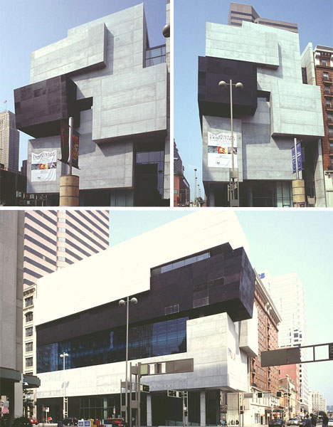
The Rosenthal Contemporary Arts Center
(images via: Mary Ann Sullivan)
London-based architect Zaha Hadid designed the Rosenthal Contemporary Arts Center in her favored “Deconstructivist” style, with stacked shapes in black and white that sometimes jut out over the sidewalk below. Made of concrete and matte black aluminum, the 85,000 square foot CAC building houses temporary exhibits of contemporary art. With this building Hadid became the first woman architect to complete a major museum project in the United States.
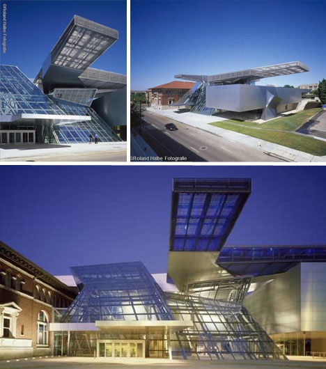
The Akron Art Museum
(images via: Akron Art Museum)
A soaring glass and steel structure is strikingly juxtaposed with a late nineteenth-century brick and limestone building at the Akron Art Museum. The 2007 addition, by Viennese architectural firm Coop Himmelb(l)au, modernizes the museum with cantilevered, suspended and floating forms including the “Crystal”, a three-story glass and steel lobby, the “Gallery Box”, an exhibition space that seems to float on air and the “Roof Cloud”, a cantilevered steel armature that extends over both the old and new buildings.
Guggenheim Museum Bilbao
(images via: Guggenheim Bilbao)
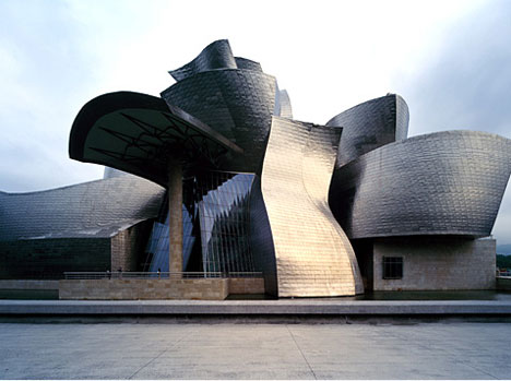
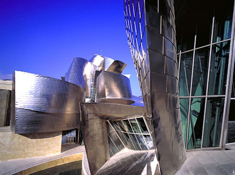
It’s often said that the Guggenheim Museum Bilbao started the trend of making the building that houses art just as important as the art itself. Designed by renowned architect Frank Gehry, it is considered among the most groundbreaking examples of architecture to have come out of the 20th century and serves as a landmark for the city of Bilbao, Spain. The design is both fluid and geometric, with its reflective titanium-clad walls sparkling in the sun. It has been credited for “putting Bilbao on the map” and admirers have even called it “the greatest building of our time”.
National Museum of Art, Osaka
(images via: arcspace)
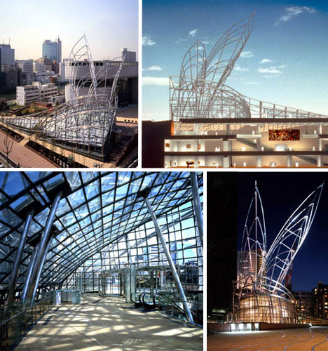
Osaka’s National Museum of Art resembles a giant metal insect, crouched on the ground with its wings extending into the air. Constructed of titanium-coated steel tubes, the outer shell of the building serves as an eye-catching sculptural form that belies the museum’s contents. Because of the constraints of the site, the building had to be mostly underground, so the steel frame and glass skylights are all that is visible from street level. Architects Cesar Pelli & Associates managed to infuse a sense of light airiness into the structure despite its subterranean design.
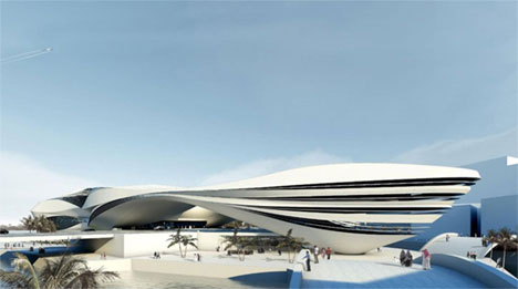
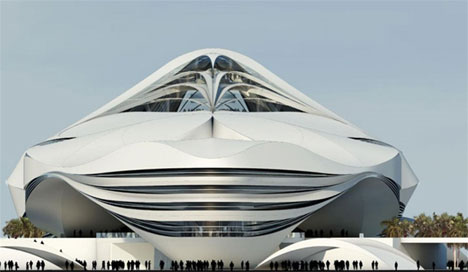
Museum of Middle East Modern Art in Dubai
(images via: Yatzer.com)
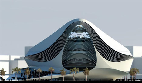
Though it has not yet been built, the planned Museum of Middle East Modern Art in Dubai definitely has people talking. The design, by Dutch architects UNStudio, exemplifies the uber-futuristic look preferred in this arid Middle Eastern city. Naturally, opinions vary, with some lauding its fluidity while others say it looks like a giant air conditioning unit.
Weisman Art Museum, Minneapolis
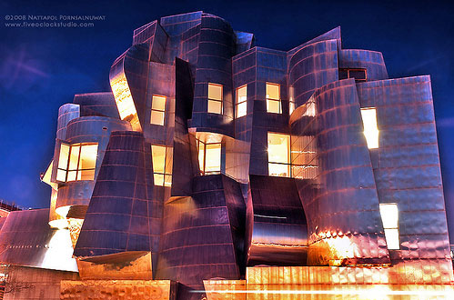
(images via: jpnuwat)
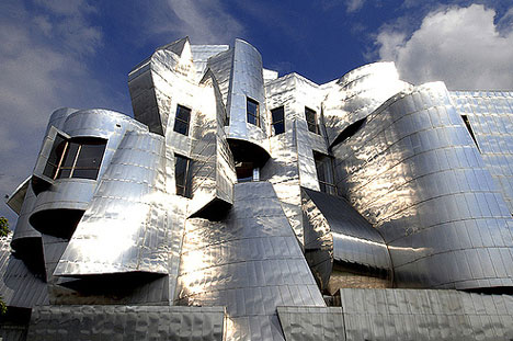
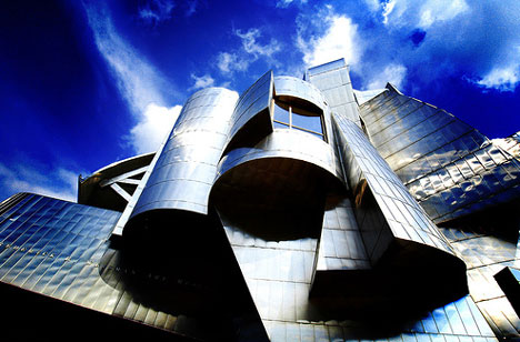
The Weisman Art Museum is another celebrated achievement of architect Frank Gehry, featuring his unmistakable titanium-clad curves. Overlooking the Mississippi River in Minneapolis, the Weisman Art Museum is among the American Midwest’s most well-known buildings. The side that faces the University of Minnesota Twin Cities is brick to blend in with the rest of the buildings, but the opposite side is a glittering abstraction of a waterfall and a fish.
The New Museum on the Bowery, NYC
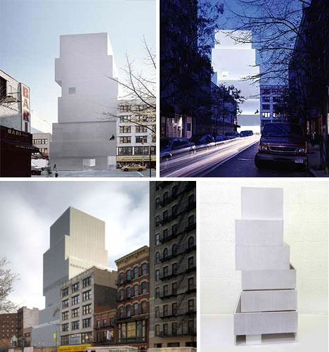
(images via: arcspace)
The New Museum on the Bowery looks like a stack of white baker’s boxes rising into the sky, clad in aluminum mesh that disguises the windows. The architecture firm SANAA rose to the challenge of the site’s restrictions, saying, “The solution of the shifted boxes arrived quickly and intuitively. Then through trial and error we arrived at the final, ideal configuration. Now we have a building that meets the city, allows natural light inside, gives the Museum column-free galleries and programmatic flexibility, and expresses the program and people inside to the world of New York outside.”
The USS Midway Museum

(images via: Midway.org)
Unusual as museums go, the USS Midway Museum is a storied naval aircraft carrier that gives the public a look at what life was like for the officers who lived and worked aboard the vessel. Docked in downtown San Diego, the USS Midway stands in sharp contrast to the carefully designed, artistic modern and postmodern museum architecture featured here. It’s certainly an example of the enclosure being every bit as important as what’s contained inside.
The Rose Center for Earth & Space, NYC
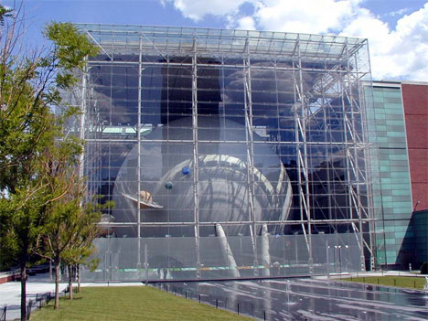
(images via: Wired New York)
The Rose Center for Earth and Space, located at Central Park and 79th Street in New York City, features a large sphere housed by a glass cube which serves as a symbol of the building’s purpose. It’s part of the American Museum of Natural History and is an extensive reworking of the old Hayden Planetarium. Polshek Partnership Architects said of their design, “Critical to the design concept is the sphere’s apparent disengagement from the enclosing structure and from its transparent curtain wall and the cantilevered spiral ramp encircling the sphere.”
The Nelson-Atkins Museum of Art Henry Bloch Building, Kansas City
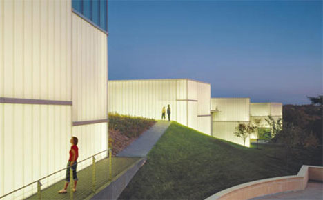
(images via: Inhabitat)
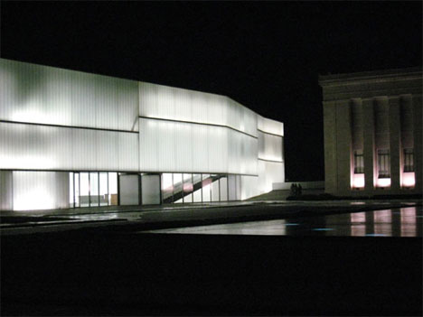
The Bloch Building at the Nelson-Atkins Museum of Art in Kansas City, Missouri takes advantage of natural light as much as possible with vast walls made of translucent glass which make the building glow like a lantern at night. The space inside is lit entirely by natural light during the day for a sustainable solution that also helps preserve the delicate historic photographs housed inside. The building was designed by Steven Holl Architects to be sculptural in nature, harmonizing with the landscape and providing more space without compromising the original 1933 Nelson-Atkins building.
The Denver Art Museum Frederic C. Hamilton Building, Denver
(images via: arcspace)
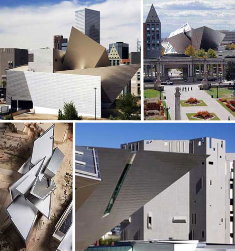
Described as “a vision of craggy cliffs”, the Frederic C. Hamilton extension of the Denver Art Museum was created by architect Daniel Libeskind to be an architectural landmark for the city of Denver. The design reflects the nearby Rock Mountain peaks and consists of large geometric shapes clad in titanium. The dramatic expansion, which houses the Modern and Contemporary art collection as well as the collection of Architecture and Design, doubles the size of the museum and now serves as its entrance.
Hedmark Museum, Norway
(images via: Leif Knutsen)
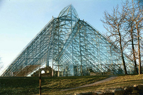
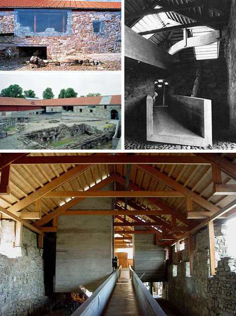
The Hedmark Museum in Norway consists of medieval ruins of a cathedral covered by a giant structure made of lightweight aluminum and glass, which both protects and highlights the original building. Architect Sverre Fehn designed the new parts of the museum to contrast with the aged stonework in a way that creates a clear separation between old and new, with striking results.
Groninger Museum, Groningen, Holland
(images via: Akbar Simonse + Panaramio)
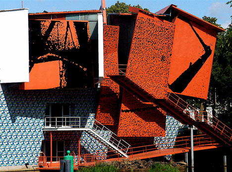
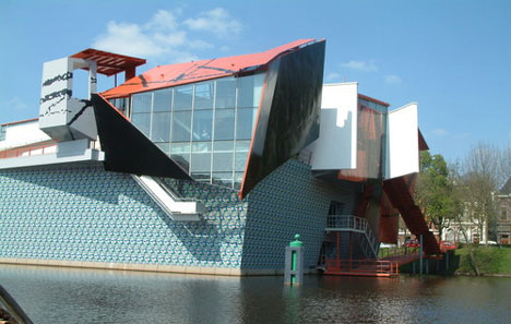
From some angles the Groninger Museum in Groningen, Holland, looks like a great ship that somehow made its way into the city canal. It’s surrounded by water, connected to the land by a pedestrian bridge. Designed by architects Philippe Starck, Alessandro Mendini and Coop Himmelb(l)au, the museum consists of three pavilions, one designed by each architect. The museum has a funky, colorful, futuristic look that’s derived from the Italian ‘Memphis’ style of architecture.
Burke Brise Soleil, Milwaukee Art Museum
(images via: Calatrava.info)
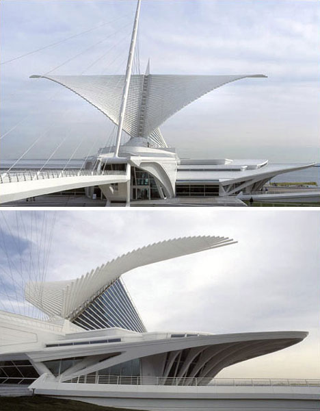
The Burke Brise Soleil is a bird-like addition to the Milwaukee Art Museum, designed by Santiago Calatrava. It’s a moveable, wing-like sunscreen perched atop the museum’s vaulted Windhover Hall. It has a wingspan comparable to that of a Boeing 747-400 – spreading 217 feet at its widest point – but to prevent damage to the building, two ultrasonic wind sensors automatically close the wings if the wind reaches 23 miles per hour or higher. It controls both temperature and light in the structure.
http://weburbanist.com/2009/01/12/creative-modern-and-postmodern-museum-designs/
No comments:
Post a Comment