cyanatrendland.com
cyanatrendland.com
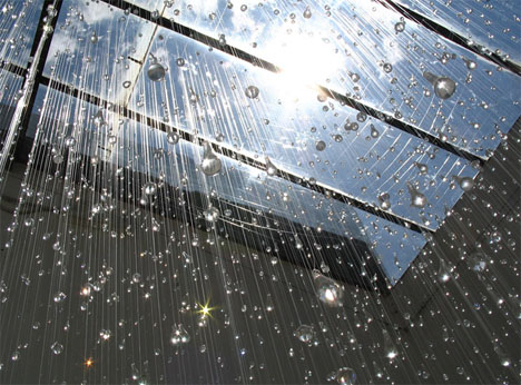
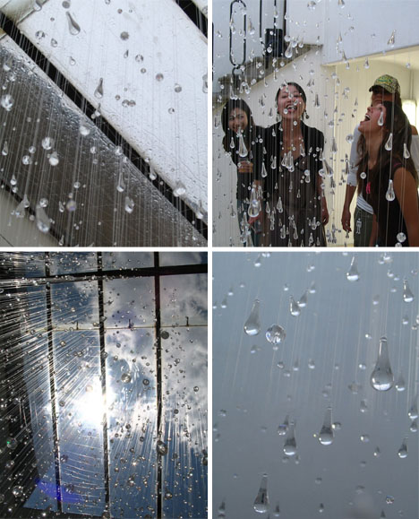
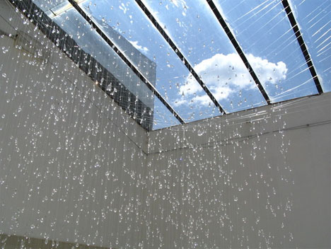
Where is the last place you expect to find rain? Indoors, of course, which makes this massive, intricate and well-executed rain art installation by Stacee Kalmanovsky not only technically impressive but a shock to the senses when you first see it.
As impressive as the hand-crafted drops strung together by hundreds of strings is the inherent interactivity of such an isolation - it invites people to move through it, brushing the motionless rain into new and unplanned directions and engendering conversations.
Despite the complexity of experience the materials are simple: fishing lines, plastic beads and a good deal of time were the core elements it took to create this. In her words: “Stacee Kalmanovsky’s work is rooted in the uncanny, suggestive, and picturesque. Her urge to invent and exaggerate is tempered by a deep dedication to the medium at hand. She believes in the conceptual process itself, from gathering information and sorting through, manipulating, and qualifying the image, to the indisposable skill to achieve the end result. Like in the alchemic process, the raw matter (sulfur = visual information) is transformed, refined, and persuaded into its purest form (gold = art).”
dornob.com
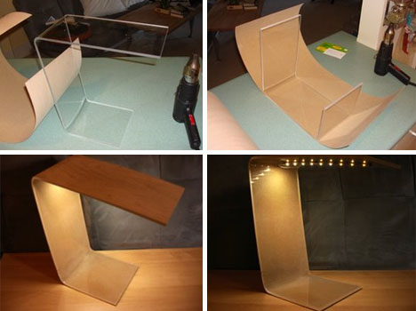
The results of do-it-yourself furniture projects are rarely so elegant as this remarkably cheap DIY bent-wood lamp project. A piece of scrap acrylic and birch veneer facing were the basic starting materials. A heat gun was used to bend the acrylic into the position shown above.
Veneering the plastic took some foil, a glue gun, an iron and a decent amount of pressure. After that, a simple-and-inexpensive Ikea LED light strip was added. All simple materials, all easy to find and relatively trivial to work with yet the result is a remarkably attractive DIY lamp.
dornob.com
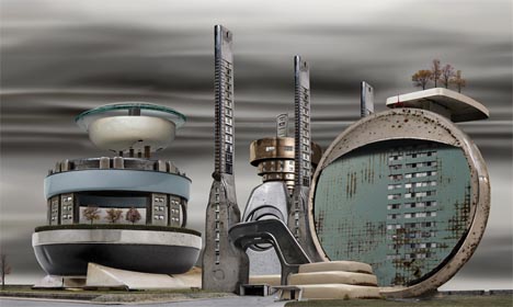
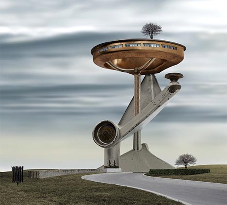
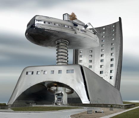
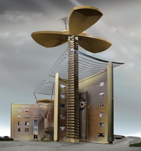
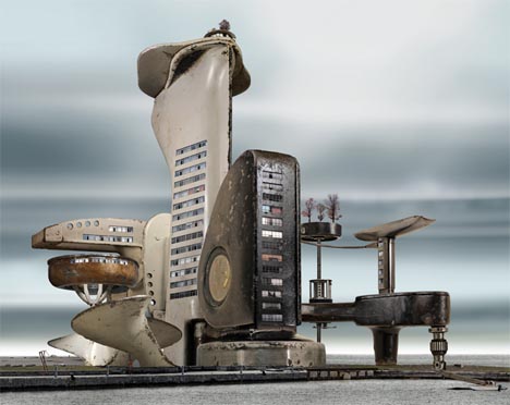
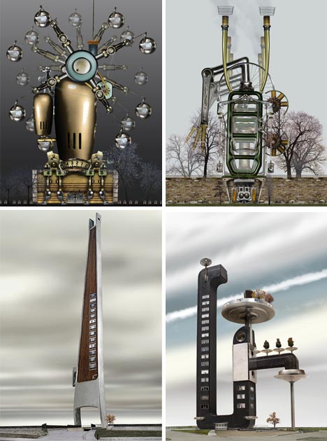
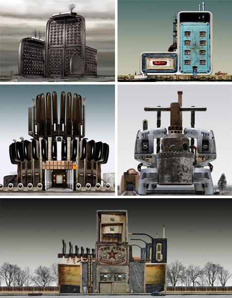
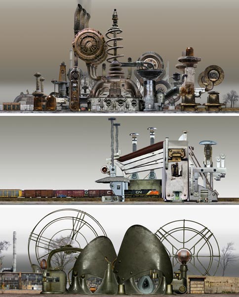
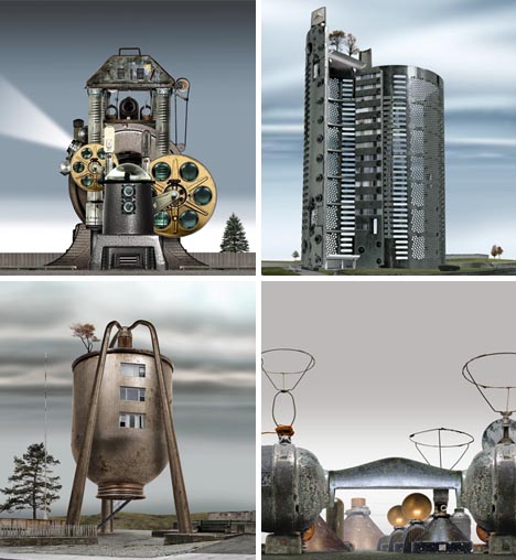
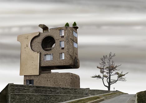
Composite creations, these surrealistic structures and miniature urban landscapes are made from real photographs. The so-called Habitat Machines and Industrial Parkland series by David Trautrimas appropriate everyday housewares - from pots and pans to faucets and fans - in fantastical Steampunk-esque city-scapes.
In everything from individual buildings to entire neighborhoods, this approach incorporates technologies with which we are naggingly familiar - even when they are not always easy to recognize when first viewing one these curious artworks. As with Steampunk, the art is in the the remix.
As cues to their origins, names are assigned to these projects including: Waffle Iron Heights, Oil Can Residence, Vacuum Tower, Hole Punch Flats, Space Heater Place, Razor Cooperative, Film Projector Factory, The Fishing Complex and The Measurement District.
By shifting the scale and editing the details of this ordinary objects, this artist taps into patterns we recognize from our everyday lives. As such, his work is about bridging the gap between reality and fantasy - the ordinary and extraordinary.
dornob.com
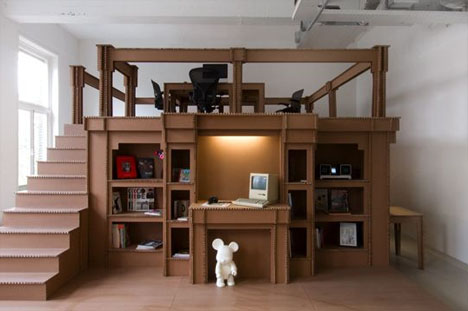
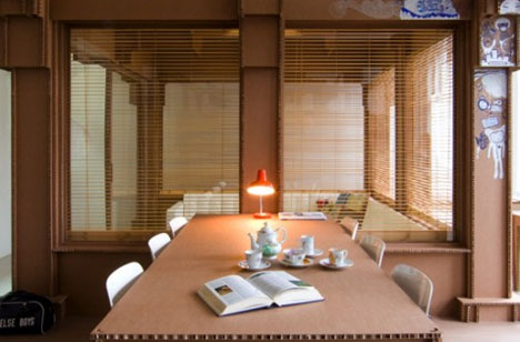
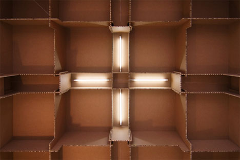
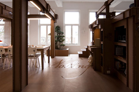
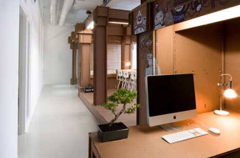
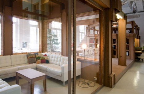
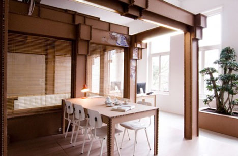
Maybe it was only a matter of time. After all, designers have been increasingly experimenting with the possibilities of cardboard for disposable housing, flat-pack furniture and other applications. Creating an entire interior out of cardboard, however: Nothing Agency is first.
What is probably most impressive about this creation is how it works with their overall goals. This was not designed in a void to be seen by a select few - it was carefully crafted to promote their agency and, from the press it has been getting, it is safe to say it has worked.
However, more than merely a viral marketing work of interior design this space is also a way to brand the studio. After all, its name is Nothing and that is what it comes from - something from nothing is the theme of their work as well as their very office.
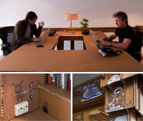
Best of all, this paper-built office was likely relatively inexpensive to construct (the materials are certainly cheap) and serves as a design canvas for them and their clients when everyone gathers to brainstorm - the beginnings of which are shown doodled above.
dornob.com
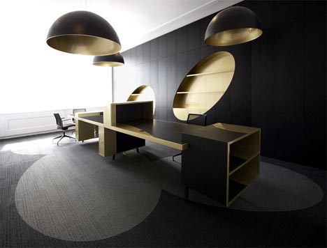
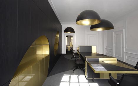
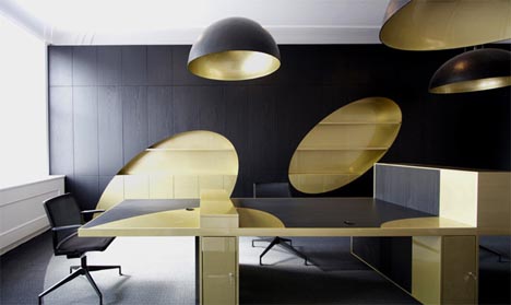
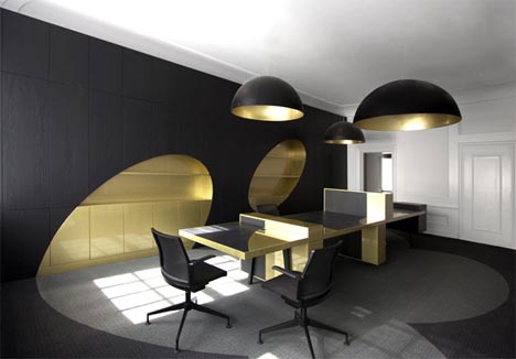
Nothing says executive power and excessive luxury like black and gold in an office design. To keep the design from getting too carried away, however, artistic touches soften and add interest to this creative conference, meeting and lounge space by i29.
The thematic focus on the idea of a spotlight is immediately obvious to an occupant - from the large circular ceiling lights to the faux-shadows they cast on the floor and the spaces on the wall also implied by their presence. This repeated theme also offsets what might otherwise be a stuffy, overly-elegant space.
Ultimately, this design strikes the right balance between conceptual and practical, artistic and functional. It serves its purposes well with ample light, seating, work and storage spaces but still makes for a radically unique office interior.
dornob.com
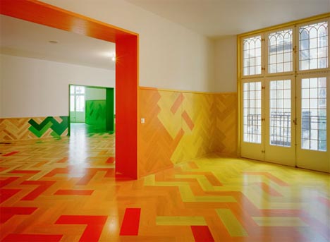
Who says you need elaborate faux ornamentation or ostentatious luxury furniture to make an interior design unique and amazing? Not only does a focus on coloring and patterning a space save money but it can make at least as much of a statement as most furniture-centric interior designs.
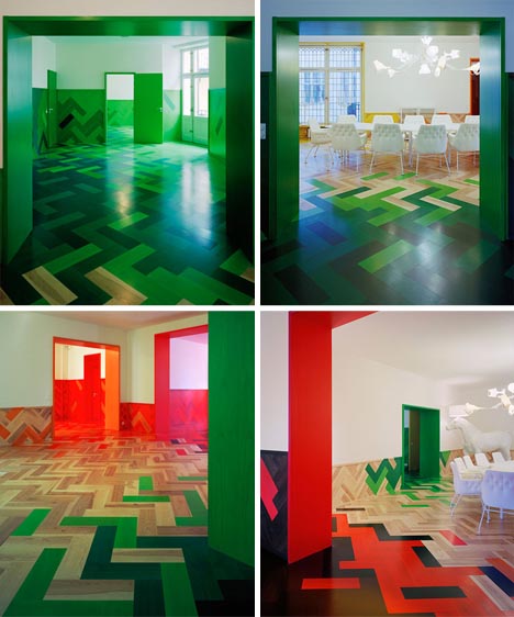
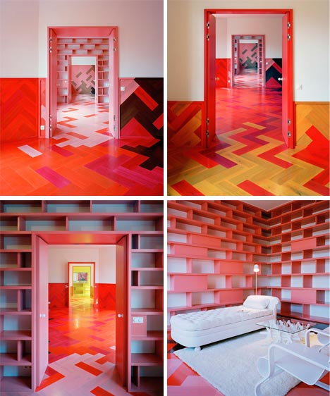
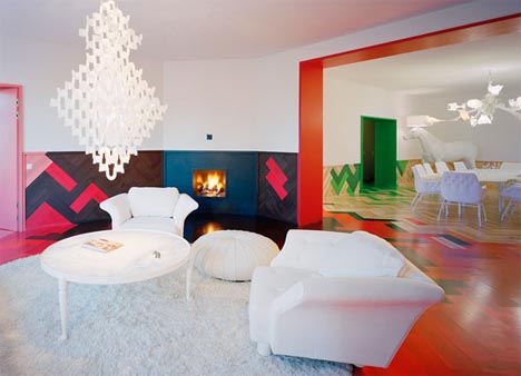
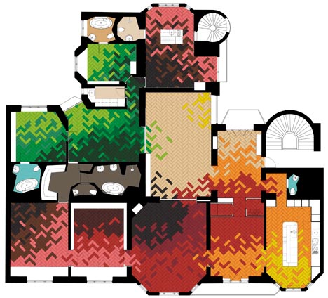
Inspired by the changing of seasons outside of this apartment, designers Tham and Videgard Hansson create a spatial experience through the shifting of colors - from winter grays and blacks through summer greens and autumn oranges - from one room to the next throughout this vast series of interior spaces.
With little of the traditional interior decoration left from this 1800s apartment space, they were forced to use outside inspiration to fill in what had become a rather dull and plain set of rooms.
Stark white furniture was used through as a way to set it apart from the brightly-colored floors and walls, keeping the design from becoming too busy and emphasizing the distinction between object and context.
While the patterns at any one location might seem playful and random there is a very rigorous overall pattern to the colors used from one space to the next, creating a series of complex spatial sequences that were planned from the outset.
dornob.com
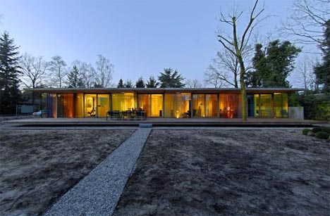
Single-floor houses have earned a sadly undeserved reputation for being inferior to their multi-story counterparts in the design culture of our day. This simple but stylish and elegant modern home shows that you do not need a second story to make a structure feel like a complete and luxurious home.
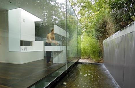
If anything, this home plays to the strengths of having only one story. For example, there is an extremely strong connection between interior and exterior - floor-to-ceiling curtain walls of sheer glass connect the owner to the natural environment from all sides of the house.
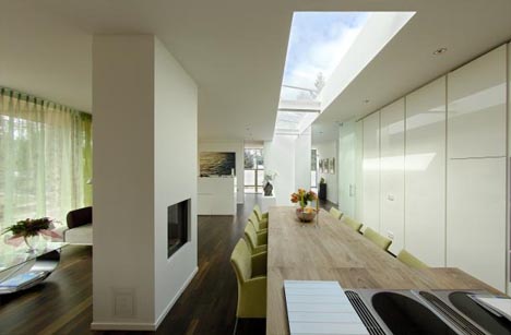
As with the many see-through walls, the accessibility of the roof works in favor of the one floor of the home. Natural sky light is available in any room of the house through strategic openings over gathering areas.
So, the next time you think about what makes a house worth admiring or living in remember that there are strengths and weaknesses to any configuration but in many cases a single-story home solution can be the better option for livability all around.
dornob.com
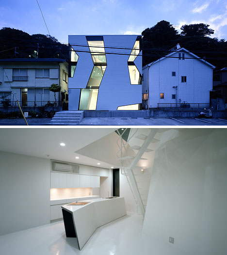
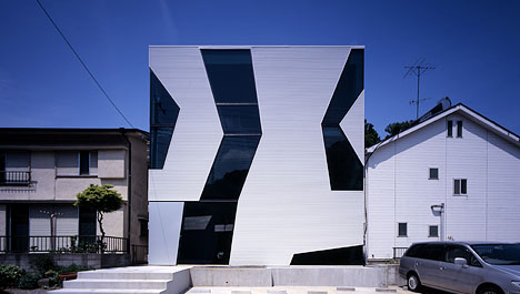
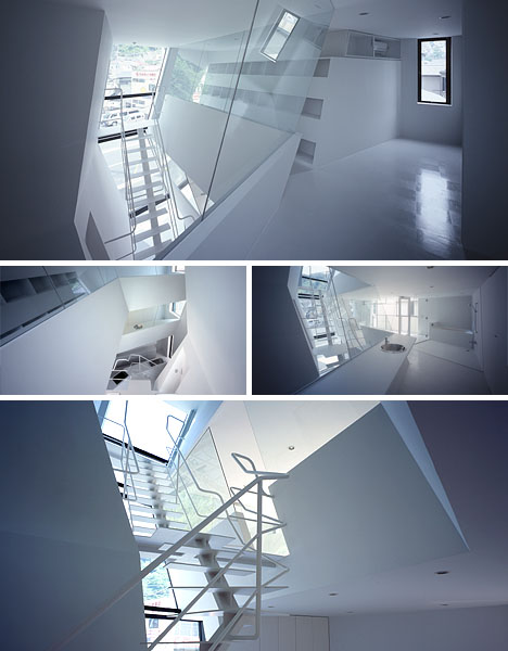
The Novela is a kind of modernist architectural experiment by October Ueda & Nakagawa Architects in maximizing interior spatial experiences. Abstract forms are not just about the art of the unusual but about carrying people through spaces that are ever-changing in dimension, shape and relative scale.
Patterns on the exterior certainly stand apart from their surroundings but are less about expressing a unique facade and more about reflecting the needs of interior volumes. Glass dividers on the inside also add to the apparent spaciousness of the rooms and a heavy dose of white keeps those spaces open and airy.
There is no doubt that these clients wanted something dynamic, modern and unique but as much as this is a one-of-a-kind work of art it is also a clever architectural design that makes the most of a small building footprint to provide engaging visual connections both within the structure and to the outside world.
dornob.com
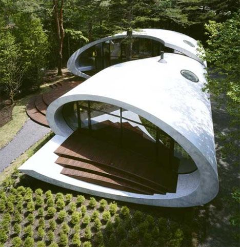
Hovering above the ground, stark white against the surrounding greenery, this Shell Villa by ARTechnic seems like a space cruiser from the future frozen in time and in a foreign place. While it stands out sharply from its surroundings this stunning structure also deforms, wraps and curves to its environment in remarkable ways.
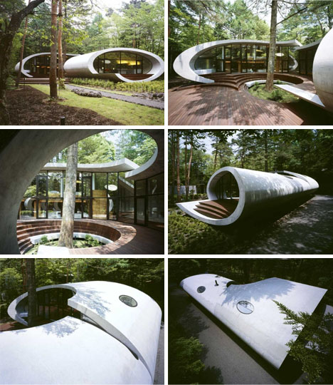
The exterior curves of this remote retreat arc around a central tree which strong informs the space shaped in the interior courtyard area. While this curious form makes for an interesting visual object it also informs how people move in, through and around it - in arcing, organic and naturalistic paths left by the voids inside and out.
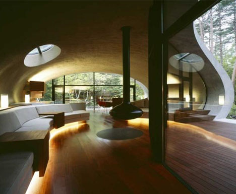
The interior of the home is as organic as the exterior, flowing and curving as the shell would suggest from the outside and with furniture, furnishings and fixtures that also conform to the ebbs and flows of the building’s shape.
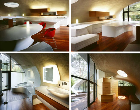
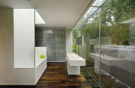
In some places, rectilinear design objects are set against the ever-present curves but they are still tucked within the overall rounded theme. The rounded shell itself provides protection from the elements for each interior space.
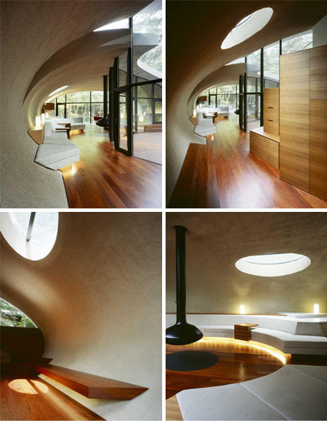
Each space flows into the next, with the common elements of white (for the shell and some furniture) and wood (for virtually everything else) tying the experience together. Likewise, natural ventilation carries throughout the whole house.
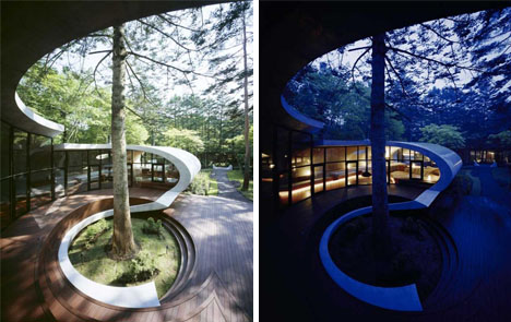
The shift from day to night in the structure is a remarkable one, as the ribbon of the building edge becomes a kind of border between the light glowing within and the ever-darkening surrounding skies and forest around.
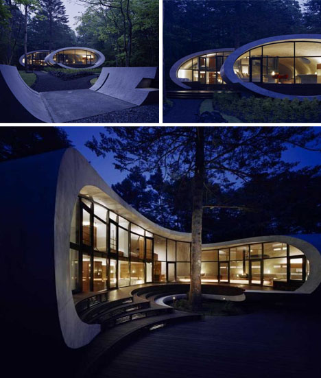
The net result at night is a sense of comfort and enclosure - a connection to the elemnents through a copious use of glass mitigated by a thick, wrapping exterior shell. All in all, the results are somehow a blend of ultramodern and completely contextual.
dornob.com