Planes, trains and automobiles: these essential modes of transportation are all part of the daily grind for millions of workers & players. Travel’s not trivial, however, thanks to architects the world over who add excitement to the journey with truly dynamic designs. Roll ‘em!
Dulles: Anything But Dull
 (image via: The Crowne Plaza Hotel)
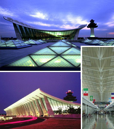
Airports aren’t just portals to and from exotic, far-away places. They also serve as first impressions for those who emigrate to another land. When your guests arrive at your front door, you want it to look nice, right? Washington’s Dulles International Airport’s main terminal, designed in 1958 by Finnish architect Eero Saarinen, was radically modern for its time and still looks new today.
Weird and Wonderful Collide in Denver
 (image via: Metafysiko)
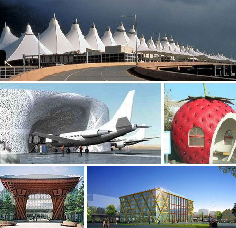
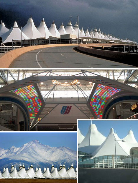
Denver International Airport is the largest in the United States and the third-largest in the world. Opened in 1994, DIA features an eye-catching terminal designed to emulate Colorado’s mighty snow-capped mountains.
 (images via: Bibliotecapleyades and Cuttingedge )
Inside though, things turn from wondrous to weird - like the odd time capsule that displays the Masonic device and some very strange murals depicting what appear to be an alien soldier, whales leaping out of a burning sea and a dead girl in an open coffin. Enjoy your fright!
Beijing’s Airport Rings with Olympian Splendor
 (image via: Showchina )
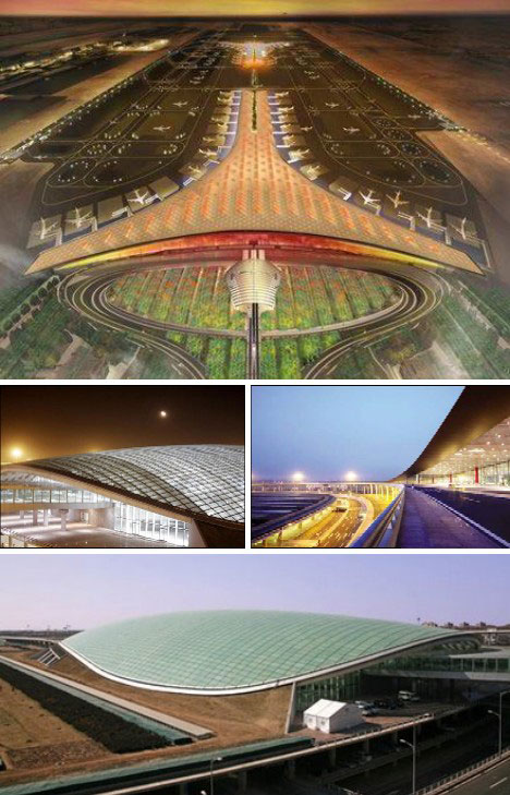
China is on track to build well over 100 new airports this decade but the highlight is the Beijing International Airport. Finished just in time for the Summer Olympic Games, the huge 1 million square meter airport is the largest in the world and, one of the most beautiful.
 (image via: Skyscraper Life )
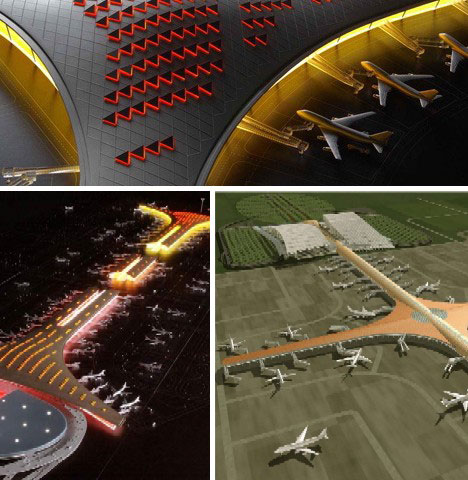
Some of the original designs for the Beijing Airport look even better, resembling nothing so much as a huge electric guitar.
Happy Landings at Funchal
 (image via: Pilot Outlook )
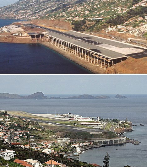
The Funchal Airport at the island of Madeira, a Portuguese possession off the coast of west Africa, looks like a design exercise but actually exists! The narrow, single 9100 ft long runway has the ocean to one side, coastal hills to the other and runs partly over a bridge.
 (image via: Structurae )
Landing at Funchal looks to be anything but fun, though it’s said pilots who expect to use the airport receive special training. Let’s hope they were paying attention in class.
Jeddah: An Airline Oasis Arises
 (image via: Designboom )
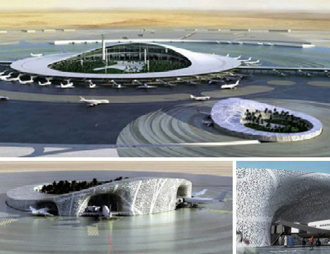
Water isn’t a problem at Jeddah in Saudi Arabia, where Jeddah International Airport rises from the desert sands like a mirage. Beautiful as it is, this exquisite airport is in use for just six weeks every year - that’s when more than 2 million Muslims fly into Jeddah on their way to Mecca for the Hajj pilgrimage.
Spanish Flew?
 (image via: E-Architect )
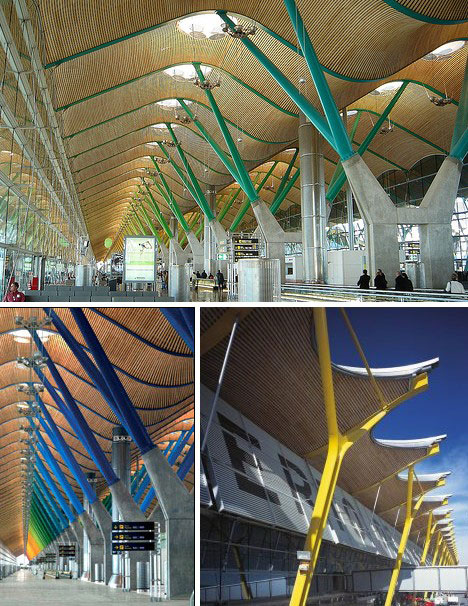
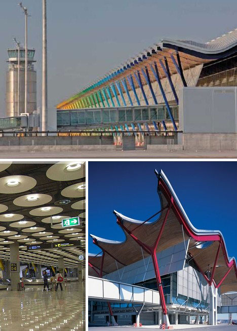
Spain recently opened the new Madrid Barajas Airport and it’s quite an improvement from the original, dating from 1933. The updated terminal is huge - 1.2 million square feet - and is capable of processing up to 75 million visitors annually
 (image via: Giramondo1 )
The architects - Richard Rogers Partnership with Estudio Lamela - took pains to make the new airport’s passenger and baggage terminals as environmentally friendly as possible, orienting them in a north-south direction and using passive design features to reduce the need for energy-intensive heating and cooling as much as possible.
Innsbruck: Nice Design; Ice Design
 (image via: James Feess )
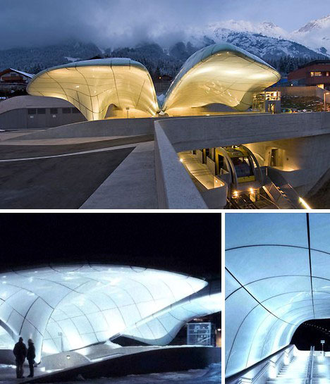
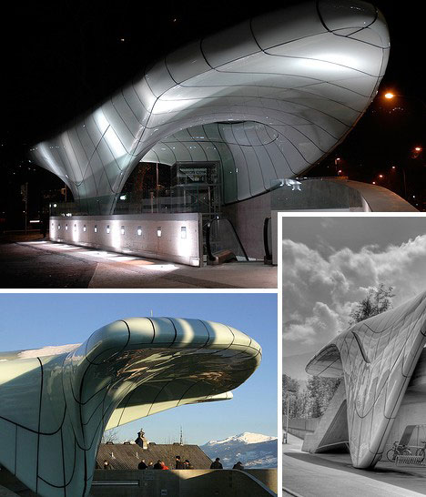
Trains have inspired their fair share of design exuberance as well, especially in Europe and Asia where rail travel has historically been of high importance to both commuters and city planners. Innsbruck, Austria hired architect Zaha Hadid to design a series of railway stations that would complement the city’s reputation as an alpine landmark.
 (image via: Architecture Revived )
Says Hadid, “We studied natural phenomena such as glacial moraines and ice movements - as we wanted each station to use the fluid language of natural ice formations, like a frozen stream on the mountainside.”
Tibet: Himalayan Mountain High
 (image via: China Daily )
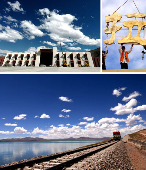
The new Lhasa Railway Station is the largest station on the Qinghai-Tibet Railway line which serves much of Tibet and southwestern China. The stark design gives respect to the abundant natural beauty in this rarefied area of the world.
Luxembourg: New Traditionalists
 (image via: JSWD-Architekten )
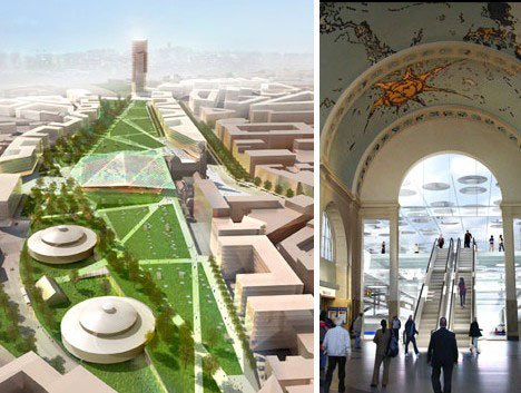
This design for the new Central Railway Station in Luxembourg manages to look forward (above left) on the outside while retaining the grand tradition of luxurious rail travel pioneered by European nations in the 19th century. The tiny nation’s first train station was built of wood in 1859.
Great Britain: Where it All Began
 (image via: Daily Mail UK )
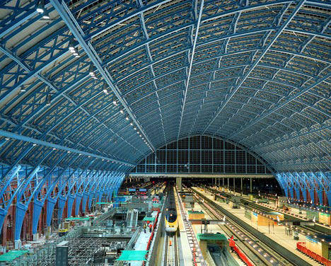
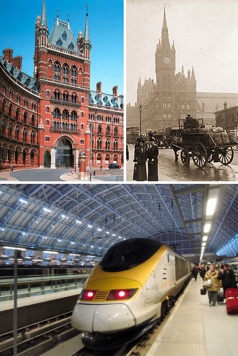
The steam locomotive was invented in England and rail travel has always figured prominently in the nation’s transportation grid. Above is St. Pancras Station in London, newly renovated to host Eurostar trains running under the English Channel from Paris yet still covered by its 1860’s vintage glass & steel roof.
 (image via: Panoramio )
St Pancras Station was slated for demolition in the 1960s but luckily reason prevailed and a true national treasure was saved for posterity. The renovation cost close to $2 billion and saw the baking of new bricks to the original standard while the gothic exterior and iconic clock tower fronting the station were spiffied up to match.
Australia: Rolling Thunder Down Under
 (images via: RIBA International Awards and Shannon McGrath )
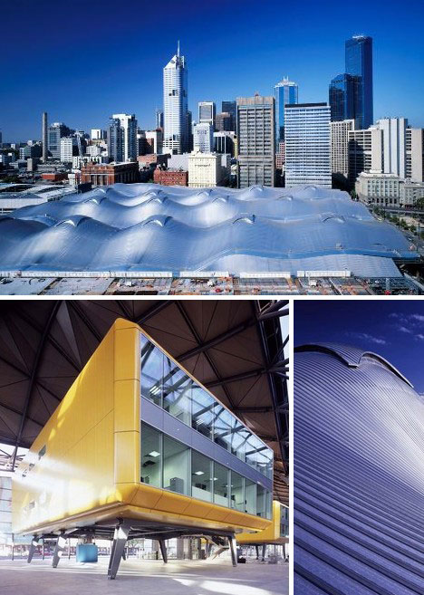
Australia is a former British colony and has inherited Merry Olde England’s love of trains and rail travel. The Southern Cross Station in Melbourne takes railway travel into the 21st century with its undulating, self-ventilating roof.
Japan: Great Gate; Cool Clock
 (image via: Paul Mannix )
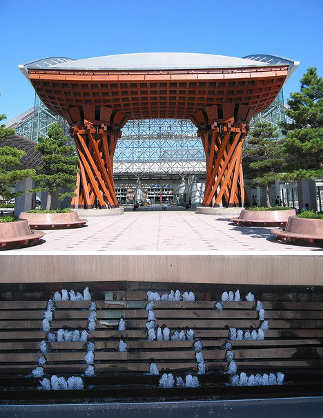
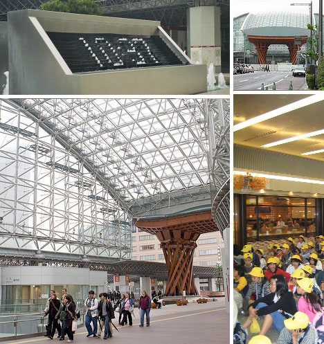
One can’t talk about trains without touching on Japan. The long, narrow, crowded country is ideally suited for rail travel and though it may be best known for its high-speed Shinkansen (bullet trains), Japan is also a center of aesthetic commercial design. Kanazawa Station is a perfect example, as the classic gate shown above illustrates so well.
 (images via: Paul Mannix and Univ. of Freiburg )
A unique feature of Kanazawa Station is the incredible digital clock that displays the numbers with jets of water! The clock is also programmed to display Japanese text messages and announcements - here’s a video of the clock in action:
Kanazawa Station digital fountain clock, via NielsViv
Fruitful Endeavors
 (image via: Neko-Obasan )
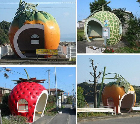
Last and… well, least are bus stops. Buses are often considered the “poor relations” of transportation but as with all publicly funded projects, their stations and stops can display a surprising degree of sophistication. They can also be just plain fun - like the fruit-flavored Japanese bus stops above.
Can’t Wait to See the Bus
 (image via: Neko-Obasan )
Here’s another goofy Japanese bus stop near Nagasaki that sports a Tai motif. Tai is a fish popularly used in sushi.
Save the Wales
 (image via: Tony Hogg Design )
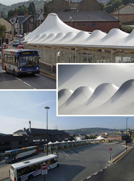
Sometimes all it takes to give an old structure new life is a snazzy new roof. Such is the case in the town of Pontypridd, Rhondda, Wales. The local municipal council asked architects Base Structures Ltd. to “design and install a bus station canopy which would provide shelter for the public and to make visiting the station a pleasant experience.” It appears they succeeded admirably.
San Rafael’s Steampunk Station
 (image via: Design By The Bay )
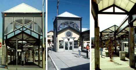
Closer to home, the San Rafael bus station near San Francisco, CA, shows off a distinct style enabled by the use of steel, concrete and etched glass. Designer Robn Chiang was given a tough chore by city planners: make the station look historical yet reflect a high-tech sensibility. Sounds - and looks - like steampunk to me!
Holland: Plastic Fantastic
 (image via: Demanio:Re )
The Hoofddorp Busstation, above, was built on the grounds of the Spaarne Hospital in Hoofddorp, The Netherlands. Opened in 2003, the station is world’s largest all-synthetic structure. The 150-foot long station is built entirely of factory-cut polystyrene foam covered in polyester fabric.
Sydney: Designing Wizards of Oz
 (image via: North Sydney Council )
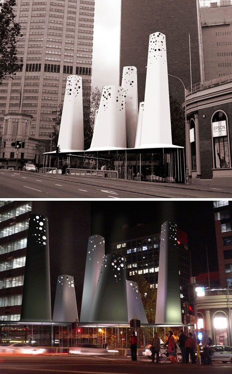
Competitions are an effective way to bring out a variety of designs at a low cost to the planning authority. The North Sydney Bus Shelter and Canopy Entrance Competition of 2006, won by Hannah Tribe and Marcus Trimble, is a perfect example. The winning design presents two diametrically opposite aspects depending on whether it’s viewed by day or by night.
Can I Ride Your Magic Bus?”
 (image via: kaveFISH )
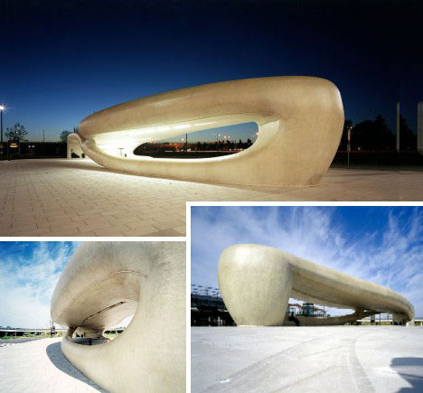
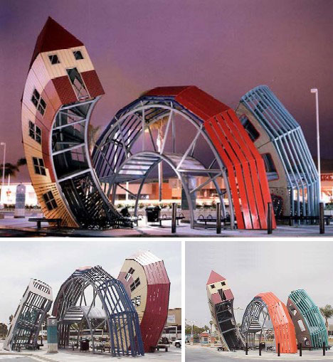
Search the globe and you’d be hard pressed to find a weirder looking bus stop then the one above, designed by Dennis Oppenheim and located in Ventura, California. Seems like the only bus stopping here would be The Magic Bus.
China’s Compact City of the Future
 (image via: AIArchitect )
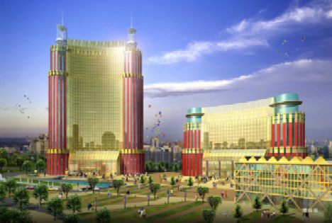
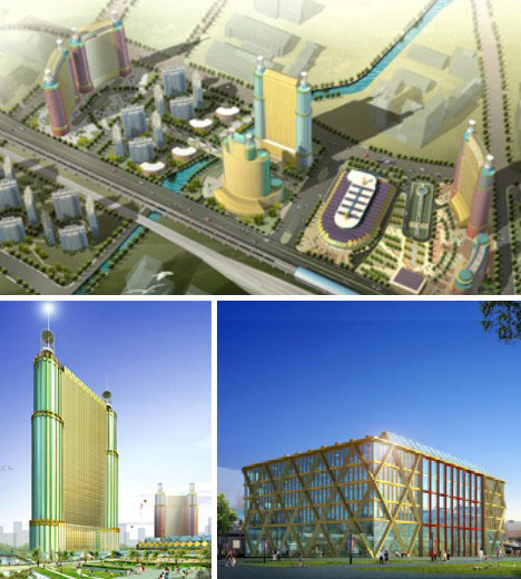
Cordogan, Clark & Associates of Chicago have drawn up an astounding concept for the Chinese city of Wuxi. The master plan envisions a Transportation Center to serve as the hub for Wuxi’s train and bus traffic, as well as being the heart of a “compact city” based on traditional Chinese colors, shapes and forms.
 (image via: AIArchitect )
The bus and train stations will feature solar energy collectors on both roof and walls. The entire complex will be situated on a 10-block footprint and house over 27 million square feet of commercial, retail and residential space. This mega-project and many others like it are set to leap off architects’ easels and into reality - these designs are moving and will move you - literally.
weburbanist.com
